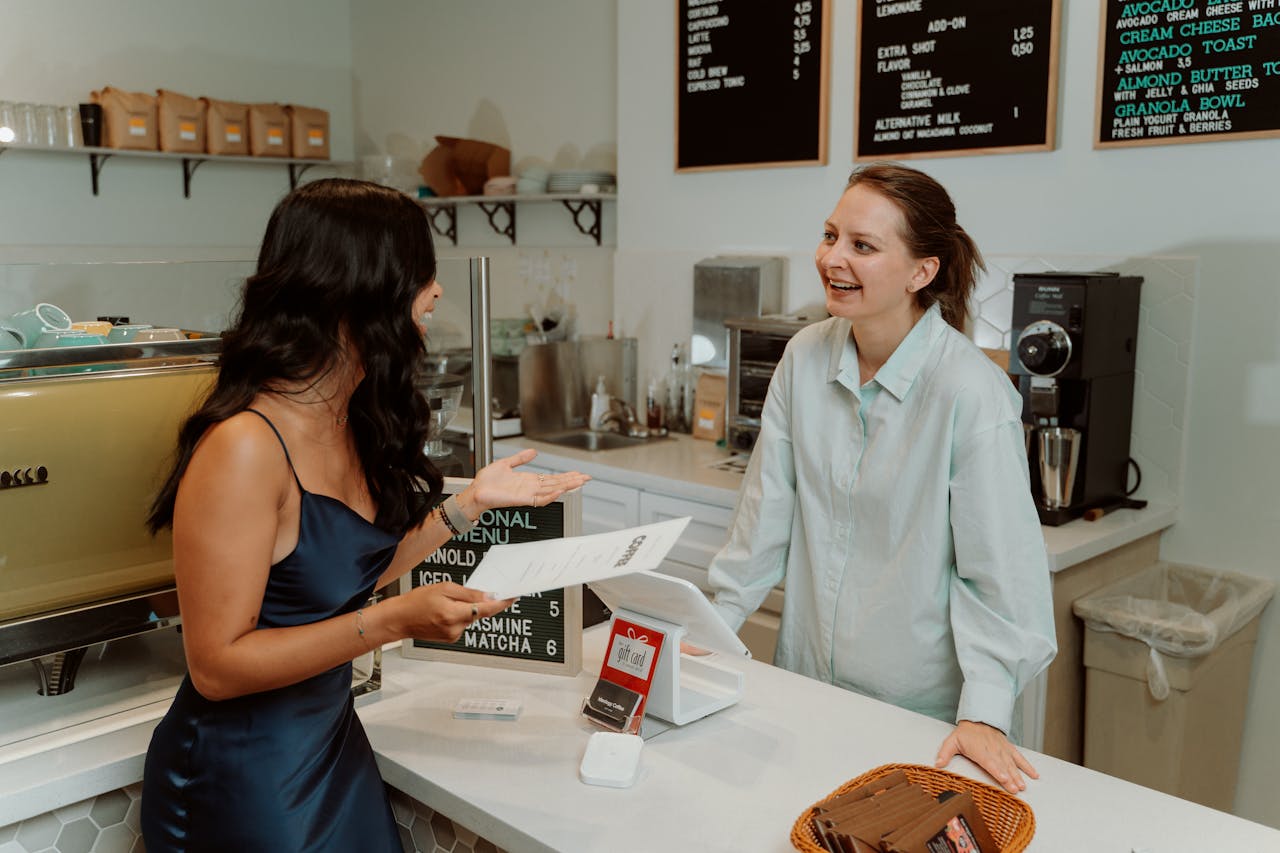
A menu looks like a simple list, but it behaves more like a map. In the first seconds, attention lands in a few predictable places, and those quick glances shape what feels tempting, what seems safe, and what gets ignored. Restaurants know this. Designers know it too. The result is a quiet choreography of headings, photos, prices, and spacing that steers decisions before appetite has time to fully speak. Once the pattern is noticed, the page reads less like dinner options and more like a story about comfort, risk, and value. In a loud room, the eyes take shortcuts, and the menu rewards whoever planned for them early.
The Header and First Dish

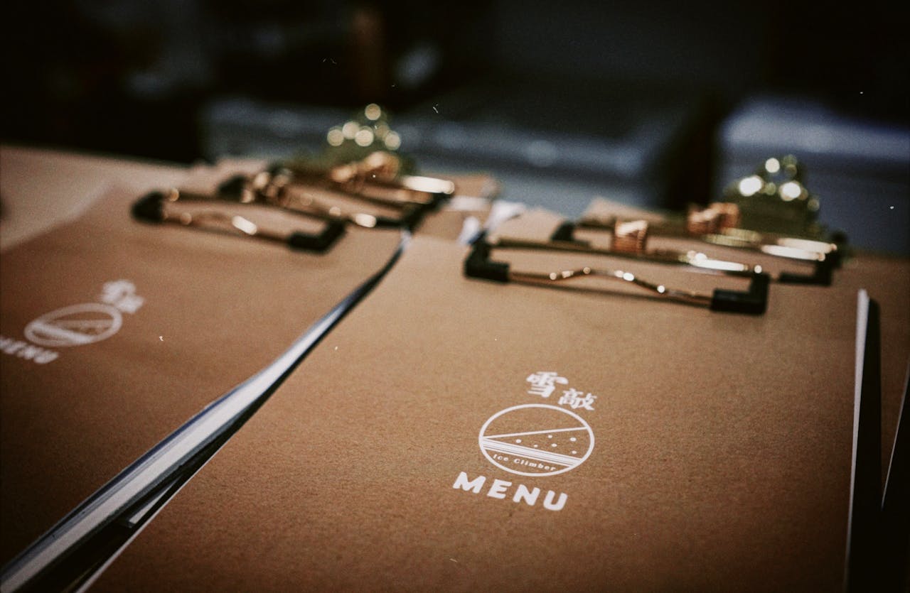
At the top, the menu’s header and the first dish do more than label the page, they set expectations in a heartbeat. A logo, a short origin line, and the opening item tell the brain what kind of place this is, whether it leans seasonal, comforting, experimental, or proudly regional, and that first description becomes the yardstick for everything that follows. Because people compare later choices against the first one they notice, an early, confident-sounding dish can nudge the whole order toward a higher spend, steer pairings, and steady the decision, while still feeling like the safest, most authentic choice overall.
The Upper Right Corner
The upper right corner is a common landing zone because many people scan a menu like a quick Z, then pause where a new column begins and the layout feels most open. Restaurants often place a premium item there and dress it up with extra white space, a bold line break, a chef’s note about sourcing, or a small symbol that hints at scarcity. Once that price is seen early, it becomes an anchor for the whole table, so midrange dishes start to feel moderate, and add-ons, cocktails, and dessert seem less like splurges and more like a normal finish even when budgets feel tight, because the mind has accepted a higher ceiling.
The Center of the Page
The center of a menu page is where attention tends to settle, especially when sections are stacked in tidy blocks and the eye needs a resting point between brighter headings and bolder prices. That middle zone often holds the dishes built to sell well, not just taste good, because it is read during the brief moment when choices turn from browsing into commitment. By placing approachable favorites and clear, confident descriptions in the center, the menu signals what is dependable, fast, and worth the price, easing decision fatigue in a noisy room and keeping the kitchen’s rhythm steady across a busy service nightly.
Anything Boxed or Framed
A box, a shaded panel, or even a thin rule line acts like a spotlight, pulling a few items out of the page and turning them into the easiest read in the room, even for someone glancing while chatting or scanning in low light. That boundary sends a simple message, these options are important, popular, or chef-approved, so attention stops comparing every line and starts looking for a match. Framed sections often hold high-margin favorites, fixed-price menus, or bundles that quietly raise the check through sides and drinks, and the design makes the nudge feel like friendly guidance, not a hard sell at first glance, too.
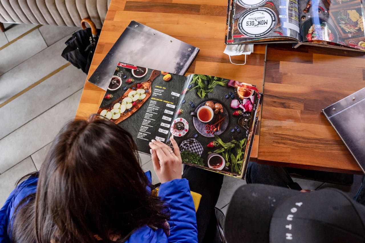
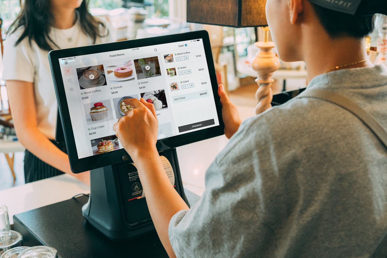
Photos and Small Icons
A photo, a chili icon, or a tiny leaf symbol interrupts the text stream and wins the next glance almost automatically, because the brain treats pictures as faster than reading. Visual cues shrink uncertainty, hinting at portion size, texture, and mood, and they also signal values, like spicy, vegetarian, or house-made, without adding another sentence. Since a picture steals attention from everything around it, menus tend to pair visuals with dishes that are profitable, distinctive, or easy to execute consistently, letting quieter items do less work, and that halo makes the pictured dish feel safer than its neighbors.
The Price Placement
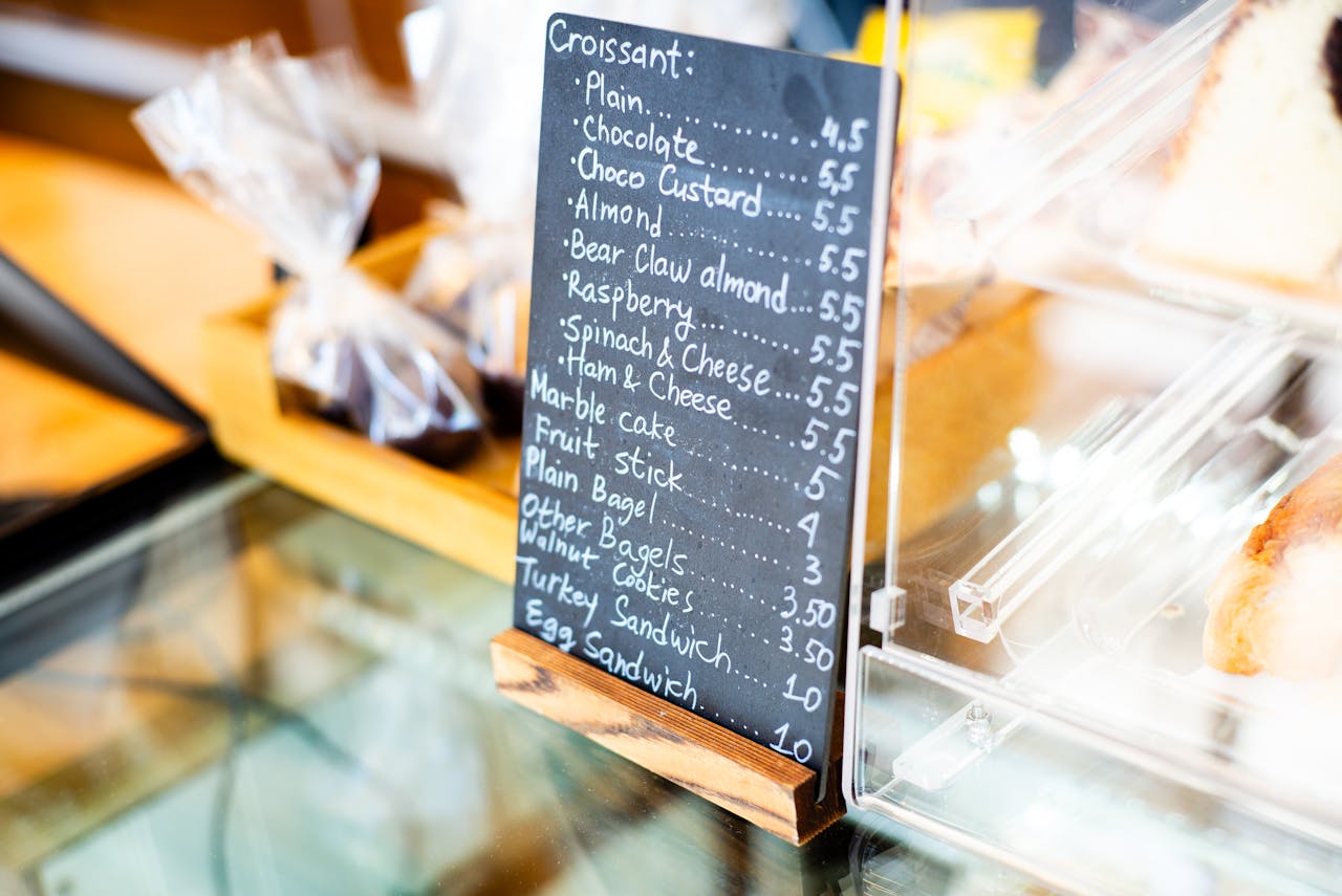
Prices are read differently depending on how they are printed, and the eyes still hunt them even when the mind is focused on food. When currency symbols repeat in a tidy column, it triggers a shopping mindset, so many menus place prices at the end of a line, use smaller type, or drop the symbol altogether to reduce the feeling of pain, and they avoid long rows of 00 that make each number feel louder. The first price that catches attention then sets the emotional temperature for the rest of the page, nudging choices toward comfort and familiarity, or toward bargains and shareables, long before the final total is imagined.
Category Headings
Category headings act as signposts, and eyes jump to them because they promise a shortcut through too many choices. When a heading is bold and specific, it tells diners where to start, what the kitchen is proud of, and what kind of appetite the room is built for, whether that means small plates for sharing, lighter midday fare, or hearty mains on a cold night. Restaurants often rename sections with mood and place, like From the Grill, Coastal, or Sunday Supper, because that single phrase colors every dish underneath it and quietly defines what feels like the normal order even before any description is read out loud.
The Descriptive Words

Dish names and descriptions are where attention goes for certainty, especially when a familiar anchor word appears, like burger, roast, or tiramisu, and the brain wants to stop searching. Specific sensory cues, like wood-fired, slow-braised, lemon-bright, or crisp-edged, create a picture faster than logic, and a small tag, like house favorite, chef’s pick, or best seller, adds social proof without sounding like an ad. That burst of language matters because it converts an unknown item into a low-risk craving, and it can make a simple list of ingredients feel like a memory worth ordering especially on a first visit.
The Last Item in a Section
The last item in a category gets a quiet advantage because the eyes often pause at the end of a list before deciding to flip pages or switch sections. That small stop, especially after several similar options, turns the final line into a convenient conclusion, so menus often place a strong closer there, either a profitable signature, a familiar classic, or a dish with an easy modifier, like add chicken or make it spicy. Recency does the rest, and the last thing seen can feel more available in memory, which is why end-of-list items can outsell better dishes that lived in the crowded middle when decisions are rushed.