A room can feel current for years, then suddenly look tied to a narrow moment. Often it is not the sofa or the paint, but the pattern doing the dating. When a repeat gets copied everywhere, it stops reading as personal taste and starts reading as a trend. Designers notice this first in motifs that shout louder than the architecture, the light, or the objects people actually use. Pattern can still be playful and layered. It just works best with restraint, mixed with texture, and given enough calm space to let the room feel like it belongs to real life.
Oversized Chevron Everywhere
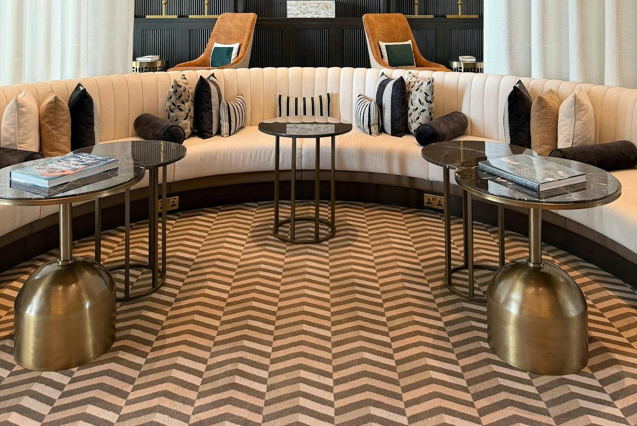
Chevron can feel crisp, but an oversized zigzag repeated on rugs, pillows, curtains, and even an accent wall locks a room to a narrow trend window. High-contrast black and white, or the familiar teal-and-gray pairing, grabs the eye before furniture, art, or natural light has a chance to speak. Designers keep chevron as a small texture, like one throw or a subtle weave, and let solids and wood tones carry the mood. If a room needs that energy, herringbone or a fine stripe delivers motion with less volume and stays believable as tastes change. Smaller scale and softened color keep the pattern from becoming the headline.
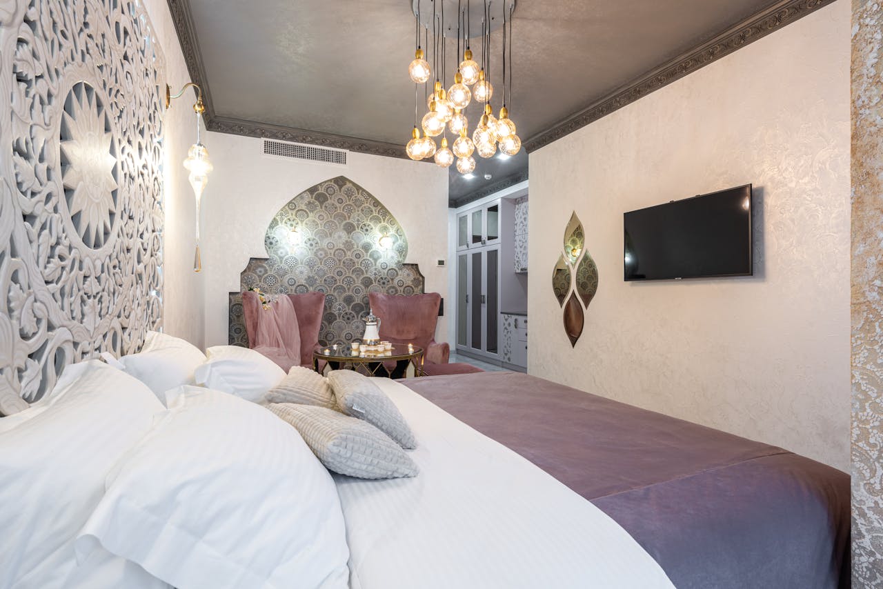
Quatrefoil On Everything
Quatrefoil reads polished in small doses, but when it shows up on every pillow, lampshade, and shower curtain, it instantly signals a past trend cycle. The shape is so recognizable that the room starts to feel like staging, especially in gold-on-white or navy-on-cream repeats paired with mirrored accents. Designers treat it like jewelry: one perforated side table, a single tile border, or a restrained fabric on one chair, then they stop. That restraint lets art, molding, and good lighting take the lead. For a similar softness without the timestamp, they lean on clean stripes, tiny geometrics, or textured solids that still feel tailored.
Gray-and-White Trellis Prints
The gray-and-white trellis print became a shortcut to looking updated, and that popularity is exactly why it dates rooms fast. It often arrives with gray floors, gray sofas, and chrome fixtures, then repeats in curtains, bedding, and quick backsplash panels until the space feels like a template. The cool grid can flatten a room, making wood, art, and plants look like afterthoughts instead of anchors. Designers keep the structure but soften the message with warmer neutrals, tone-on-tone texture, or a hand-drawn motif with small imperfections. Even swapping to a relaxed stripe or a quiet check keeps things clean while feeling more lived-in.
All-Over Typography Prints
Typography as pattern dates quickly when the design is literal and loud, with repeated script words, faux chalkboard menus, or giant block letters spelling out a room’s job. Once the message becomes the decor, the space loses flexibility and starts to feel cluttered, especially when signs compete across walls, towels, and shelves. Designers replace words with pattern that communicates through shape: woven stripes, small checks, or an abstract print that adds energy without instructions. The room still feels intentional, but it can evolve as tastes change, without having to explain itself every morning.
Faux Tuscan Borders And Sponge Paint

Faux Tuscan scroll borders and sponge-painted walls date a room because they imitate old-world character without the craft that makes real aged finishes feel honest. A vine band near the ceiling pulls attention upward and can shrink the room, while sponge texture looks blotchy under LEDs. Designers strip the theme and keep the warmth: limewash, soft plaster, or one zone of handmade tile provides depth without the mural effect. Earthy color can stay, but it works better in solid paint and textured textiles than in tricks. Paired with simpler hardware and natural materials, the room feels calmer and more current, while still welcoming.
Buffalo Check Overload
Buffalo check is classic on a blanket, but when it spreads across curtains, chairs, wall art, and table linens, it turns farmhouse into a costume. The bold black-and-white grid competes with wood grain and shiplap, and paired with galvanized metal and mason-jar lighting, the room starts to feel staged. Designers keep one check piece and break the uniform with softer plaids, solids, and natural textures like linen, jute, and leather. A smaller scale or a warmer colorway, like cream and charcoal, helps the pattern relax. That mix keeps the comfort while letting plants, artwork, and daylight carry the personality.
Wall-to-Wall Tropical Palms
Tropical palm prints can feel breezy, but wall-to-wall fronds in saturated green often date a room to the vacation-at-home craze. The scale is usually so bold that the space feels loud on quiet days, and the pattern fights neutral sofas, rattan, and brass that were meant to soften it. Designers save big palms for small spaces, like a powder room, or keep them to one wall and let the rest go calm. For everyday rooms, they keep the tropical mood with one botanical artwork, real plants, or textured grasscloth paired with solid linens and warm wood. The room still reads fresh, but it stays flexible when tastes shift.
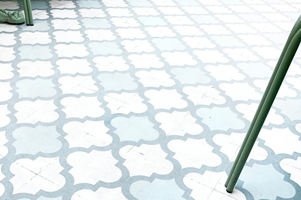
High-Contrast Moroccan Tile Prints
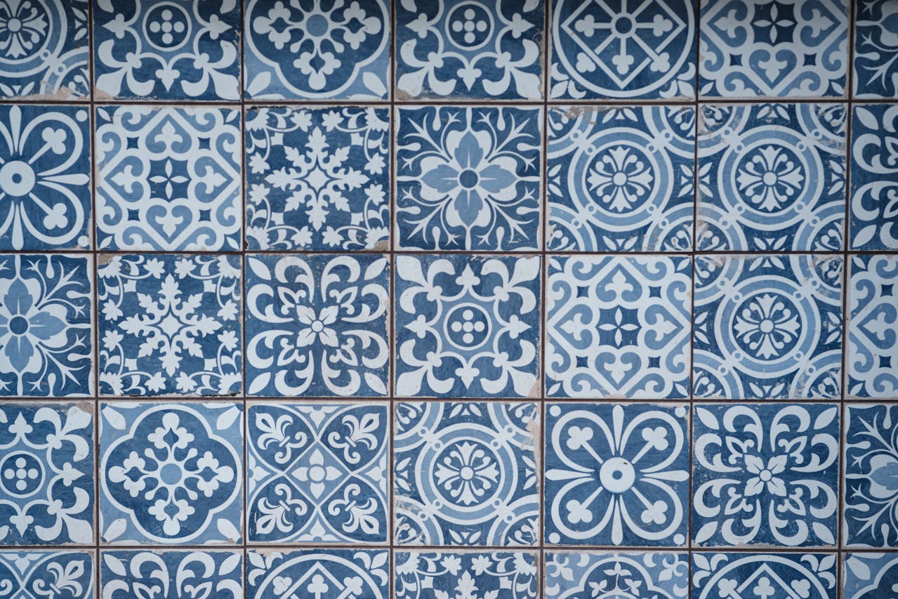
High-contrast Moroccan tile prints became popular because they add instant character, but repeating sharp black-and-white geometry across floors, showers, and backsplashes can date a space fast. When the pattern sits on top of a home’s architecture, it reads like a trend overlay, especially as peel-and-stick or printed vinyl. Designers still love pattern, but they ground it: one patterned cement tile rug, a softer palette, or a single niche of handmade tile can carry the interest. That approach adds craft and depth while leaving the space free to evolve with paint, hardware, and textiles over time.
Marble Prints On Everything
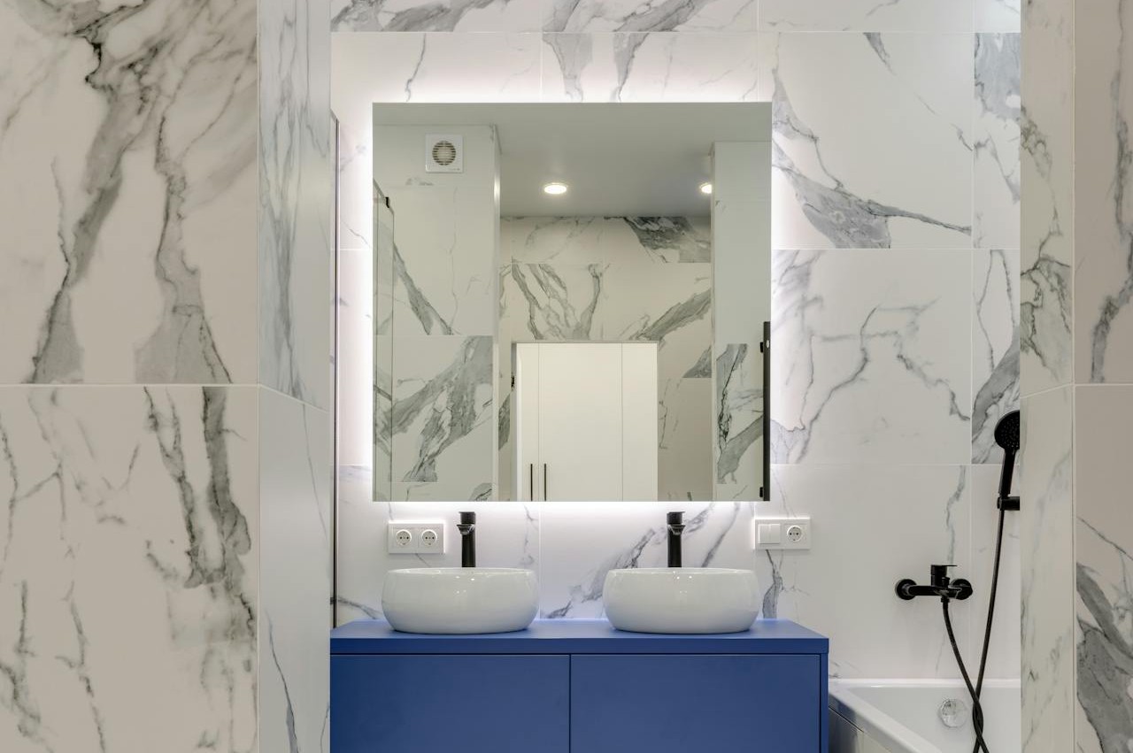
Real marble can age beautifully, but marble-print everything dates fast because it reads like a shortcut, not a material choice. When veining shows up on contact-paper counters, plastic trays, bedding, and phone-case decor, the motif stops feeling special and starts feeling copy-pasted. Designers pick one honest marble moment, like a small side table or a backsplash slab, then balance it with warm wood, matte metals, and solid textiles. If stone is not the plan, honed quartz, terrazzo, or simple ceramic can provide quiet texture without fake veining. Fewer pieces, better placement, and the room breathes.