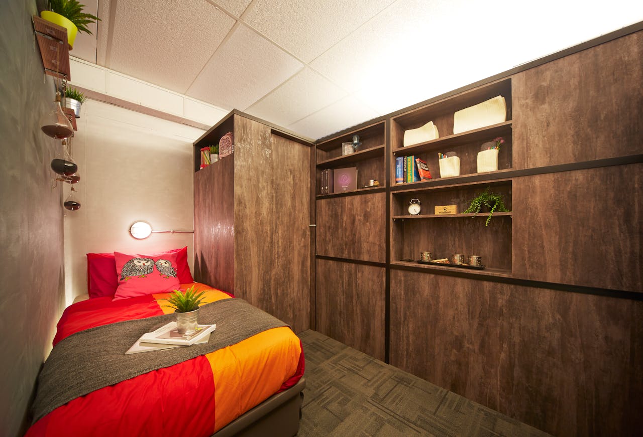
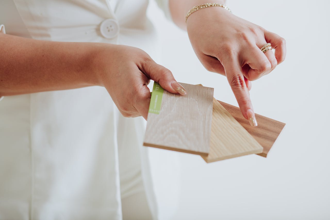
Homes look richer when they feel collected, not matched. Mixing wood tones creates that layered depth because real rooms rarely come in a single stain. Light oak beside walnut, or espresso trim near honey floors, adds dimension and makes furniture feel chosen instead of temporary. The key is balance: repetition, scale, and undertones matter more than perfect sameness. Done well, mixed woods make a space feel warmer, more grounded, and quietly confident, like it has been edited over time rather than bought in one weekend.
Anchor The Room With One Dominant Wood
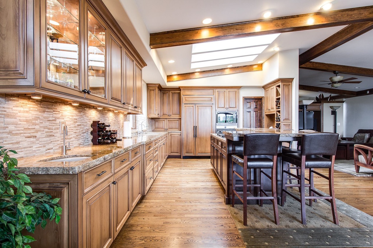
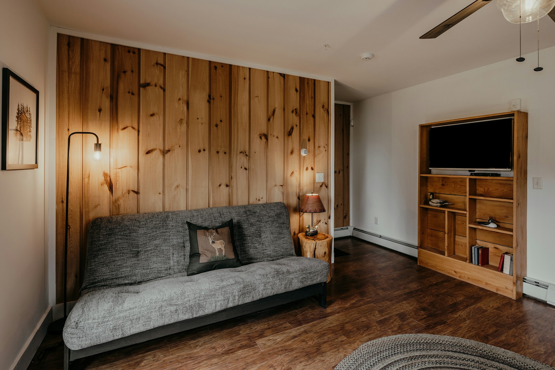
A room looks richer when one wood tone clearly leads and the others support it. Designers often treat the floor, large casegoods, or built-ins as the anchor, then layer in one or two secondary tones through side tables, chairs, and frames. This keeps the mix from feeling scattered and gives the eye a stable base, so contrast reads as depth instead of noise. The anchor also sets the room’s temperature, warm or cool, which helps every new piece make sense. When the main wood has a strong undertone, repeating that undertone elsewhere, even in small accents, keeps the whole space tied together.
Repeat Each Tone At Least Twice
Mixed woods look expensive when they are repeated, not sprinkled. A walnut coffee table feels planned when that same depth appears again in a picture frame, a tray, or a lamp base, even if the pieces do not match. Designers aim for at least two appearances per tone so the palette feels stable and intentional. Repetition can be subtle: a dark wood bowl on a shelf, a medium-tone stool, or a small side chair. The point is to create echoes across the room so the eye reads a rhythm, not a random collection. That rhythm makes the space feel curated, and it makes future updates easier because new pieces have clear neighbors.
Match Undertones Before Matching Shade
The difference between “rich” and “off” usually comes down to undertones. Mixing a cool, ashy oak with a warm, orange pine can feel tense, while warm oak paired with warm walnut reads smooth even with contrast. Designers check undertones in daylight, not just store lighting, then choose woods that share a similar base, whether golden, red, or neutral. Shade can vary, but the color language stays consistent, which keeps the room calm. When undertones clash, the space feels restless. When they relate, the mix feels collected, like the pieces belong together even if they came from different decades and different budgets.
Use Painted Pieces As A Neutral Bridge
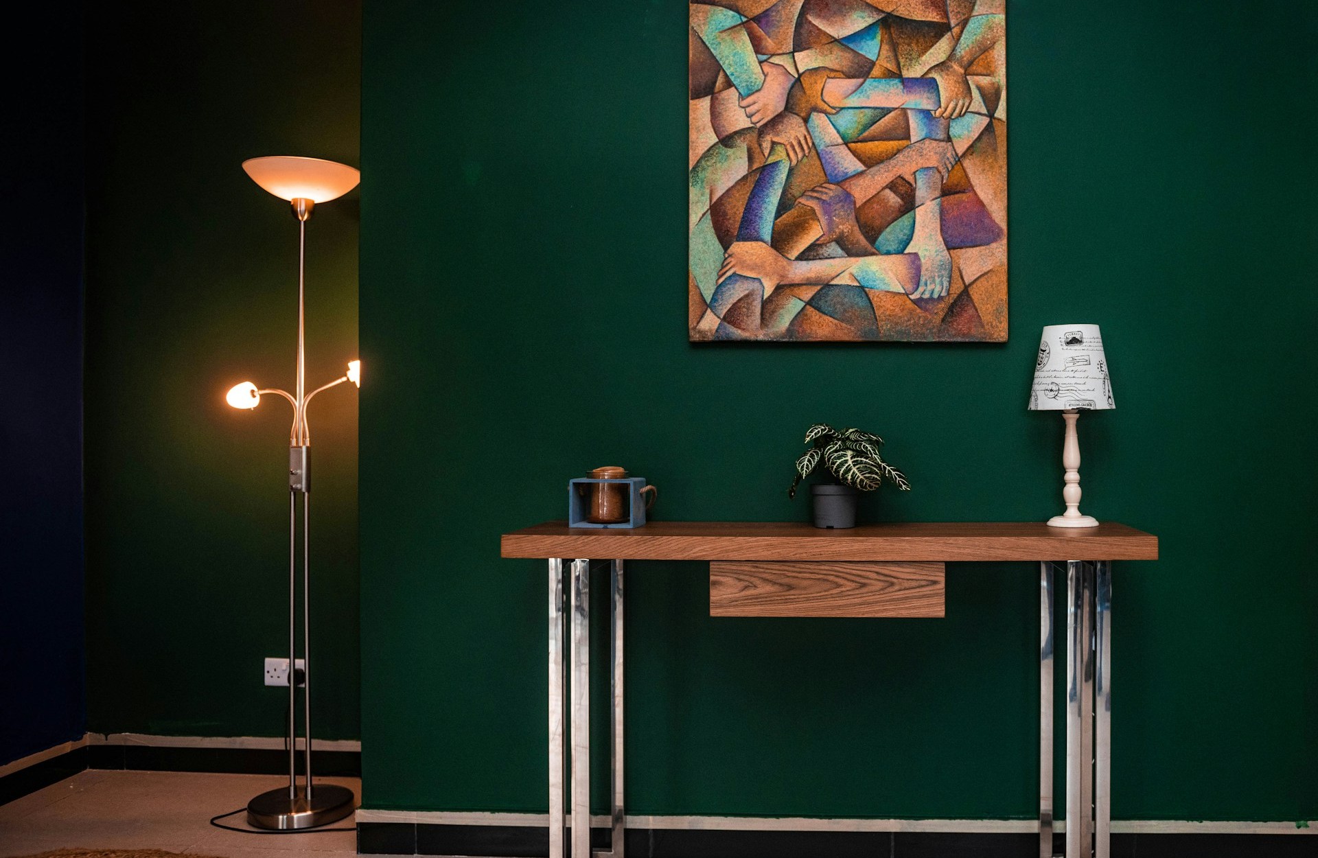
Painted furniture can bridge wood tones by giving the eye a calm pause between stains. A black or charcoal console, a cream cabinet, or a painted coffee table base helps light and dark woods share a room without competing for attention. Designers use these neutral breaks the way a good outfit uses shoes or a belt: to ground the whole look. This is especially helpful in open layouts where floors, cabinets, and dining furniture meet in one sightline. Painted pieces also make the surrounding wood look warmer and more valuable by contrast. The result feels edited, not busy, and it keeps the palette flexible when a new chair or table arrives.
Vary Grain And Keep Sheen Calm
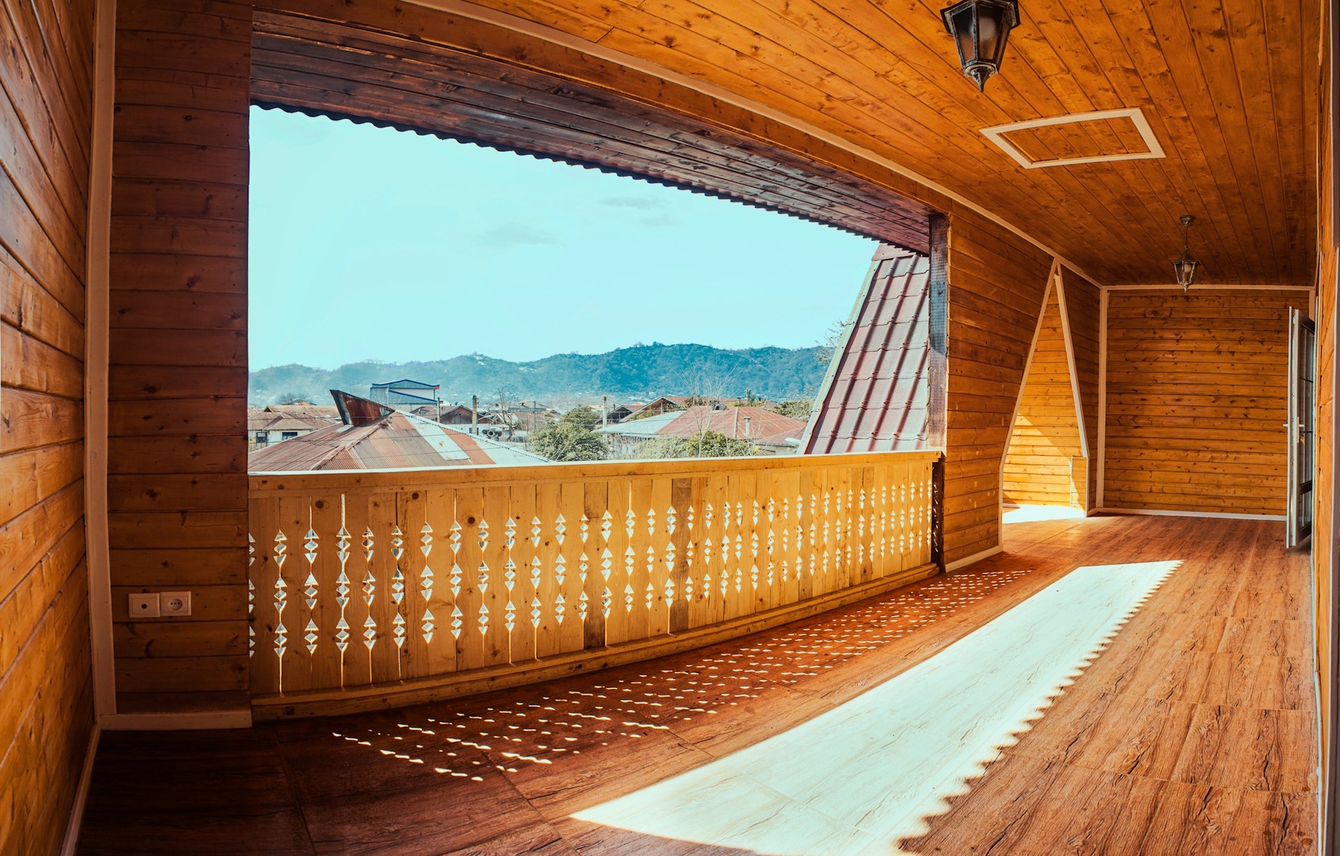
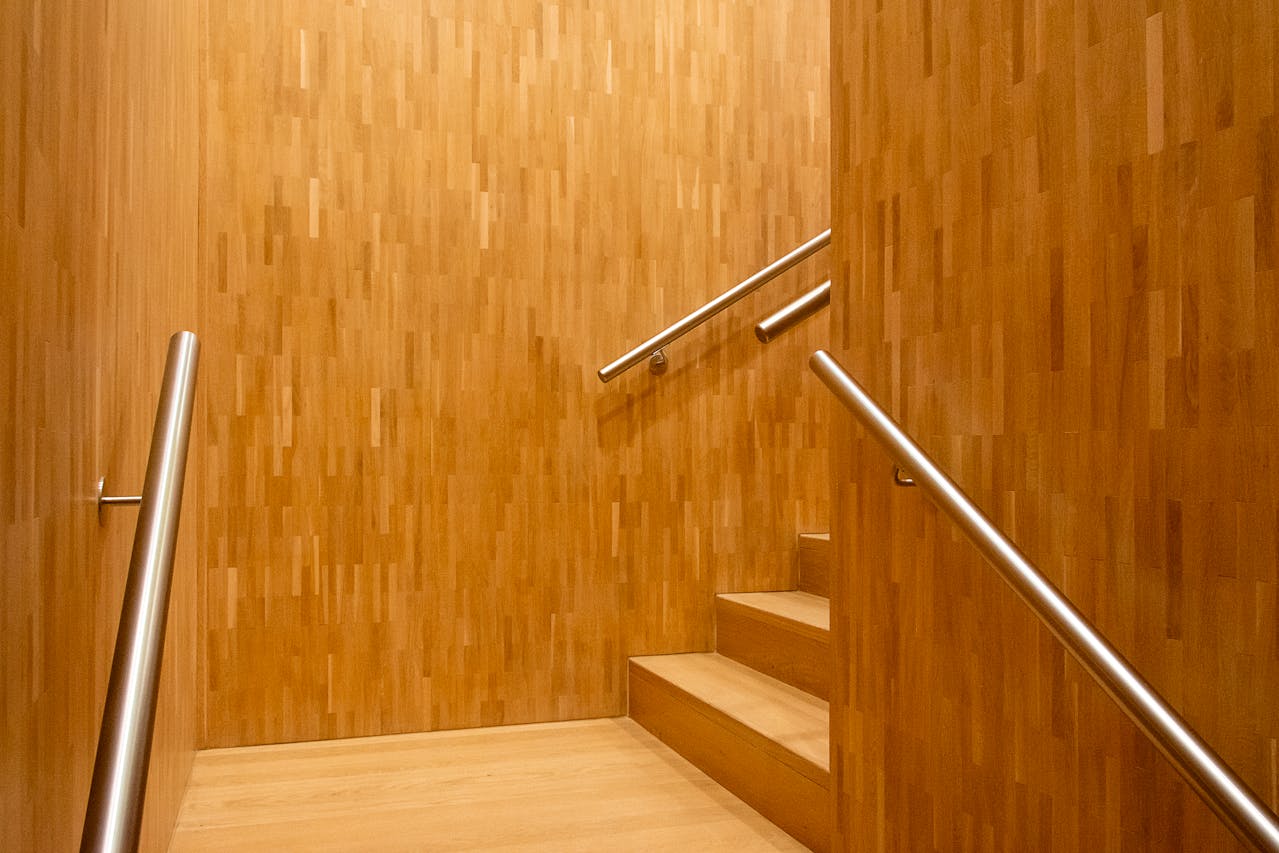
Luxury often shows up in texture, not in more stuff. Mixing wood tones looks richer when grain patterns and sheen levels vary, because the room gains depth beyond color alone. A sleek, low-sheen walnut cabinet beside a lightly grained oak table feels more collected than two glossy pieces fighting under bright light. Designers also avoid high-shine finishes that can look cheap and show every fingerprint. Matte or satin woods tend to feel calmer and more natural. Even within one tone family, combining tight grain with wider planks adds quiet interest. The mix starts to read like it evolved over time, not like it was ordered as a set.
Let One Piece Be The Statement Wood
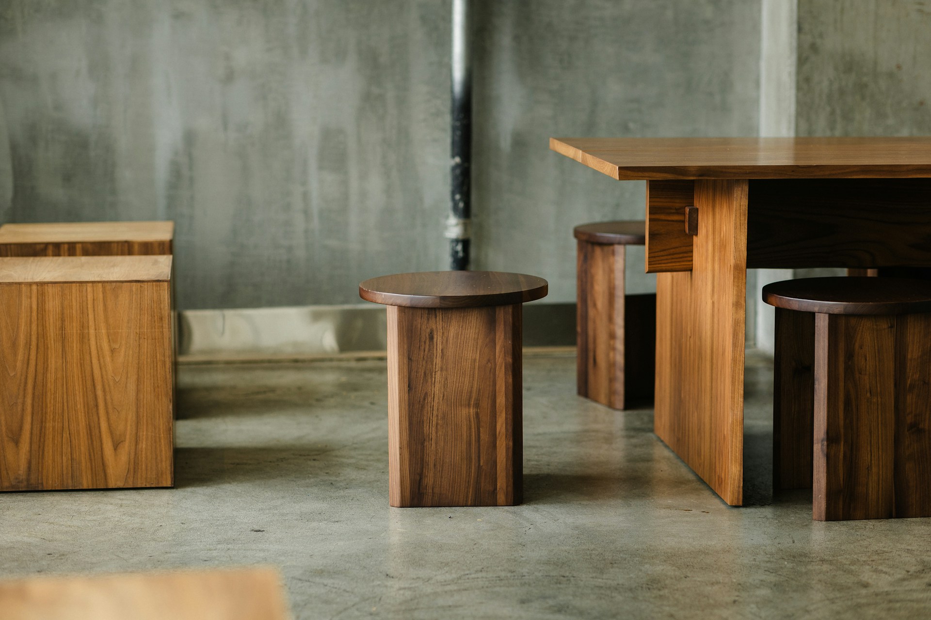
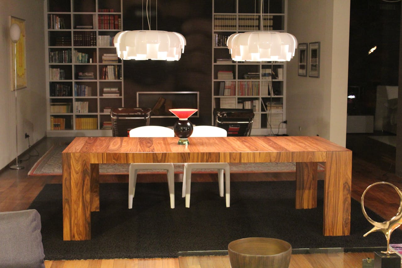
Multiple woods work best when one piece is clearly the star. Designers often choose a statement wood item, like a sculptural dining table, a vintage credenza, or a carved headboard, then keep the supporting woods simpler in shape and quieter in finish. That hierarchy creates purpose. The statement piece gives the eye a place to land, while the other tones act like layers, not rivals. This also prevents the room from feeling like a showroom of competing stains. When the hero wood has strong character, the rest can stay calm, and the overall space still feels richer because it looks intentional and controlled rather than crowded with “interesting” surfaces.
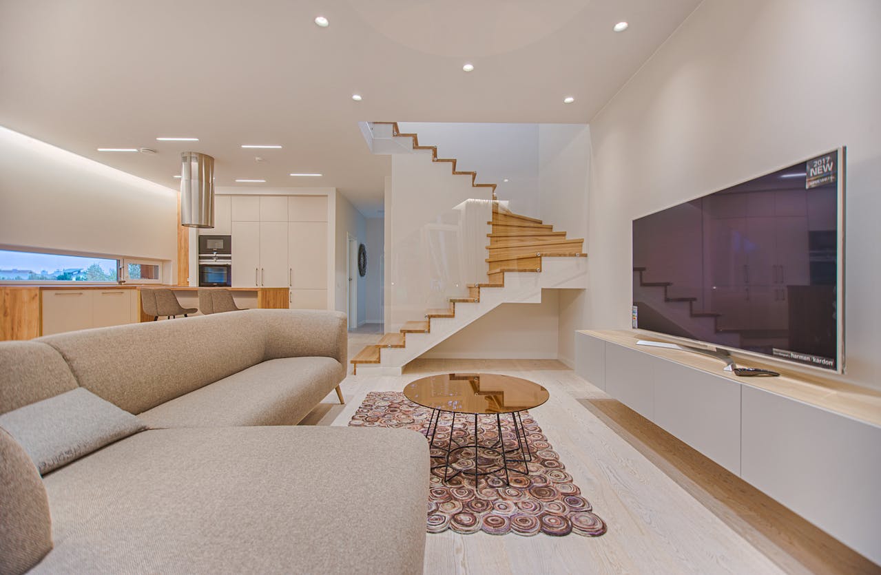
Carry A Through-Line Tone Between Rooms
Homes feel richer when wood mixing continues across spaces instead of stopping at a doorway. Designers often pick a through-line tone that appears in nearby rooms, like the same warm oak in stools, frames, and a bench, even if each space has its own main furniture. This creates continuity without forcing everything to match. In open-plan homes, the through-line helps the kitchen, dining, and living areas feel like one story, not separate purchases. It also makes the home easier to update, because the palette already has a flexible backbone. When the eye catches that repeated tone, the whole layout feels calmer and more finished.
Use Natural Textiles To Soften Transitions
Mixed wood tones look richer when natural textiles soften the transitions. Linen curtains, wool rugs, leather accents, and woven baskets add warmth and help different stains feel related, even when the pieces are different ages. Designers treat textiles as blenders, especially when wood finishes vary in sheen or have visible wear. A large rug can also separate dining wood from living wood in open spaces, making the contrast feel purposeful instead of accidental. Soft materials keep the room from becoming too hard or shiny, which can make mixed stains feel harsh. With textiles in place, the woods read as cozy and layered, like a home built for real life.
Balance Woods With A Consistent Metal Finish
Metal finishes can keep mixed woods from drifting too warm or too heavy. Brass and bronze complement warm woods, while nickel and black iron can cool things down and add structure. Designers often choose one main metal finish and repeat it, just like wood, so the room feels consistent even when stains vary. Hardware, lighting, table legs, and mirror frames are easy places to do this. A black iron pendant over warm oak, for example, can make the wood look deeper, not louder, because the contrast feels controlled. When metal is handled with restraint, it works like punctuation, helping the whole room read clearly.
Let Patina And Time Do Some Work
Rooms look richer when they feel human. A slightly worn oak bench beside a newer walnut table can add a sense of time, like the home has a history, not just receipts. Designers often mix vintage and new on purpose because patina makes wood look deeper and less flat. Minor variations in tone, softened edges, and small marks can help different woods coexist, since nothing is trying to look factory-perfect. The key is care, not perfection: clean surfaces, stable joints, and good lighting. When wood looks cared for, even with age, it reads as valuable. That gentle realism is what makes mixed tones feel believable.