Scrolling through retro food clips can feel like opening a bright, noisy time capsule. The 1960s package aesthetic was bold, optimistic, and built for expanding supermarkets, so it makes sense that short videos treat those boxes and cans like lost design perfection. But the same era carried tradeoffs that rarely fit in a short reel: less standardized nutrition details, heavier materials, and marketing that sold lifestyle first and facts later.
Nostalgia catches the surface quickly. A fuller view shows what those packages promised, what they hid, and why they still feel magnetic in kitchens, feeds, and memory across generations.
Swanson TV Dinner Trays That Made Weeknights Feel Futuristic
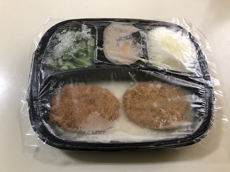
The aluminum TV dinner tray still reads like peak mid-century optimism, and it resurfaces online. Swanson turned frozen meals on a tray into a mass ritual, and by 1954 it sold 10 million trays in one year. The package looked efficient, modern, and almost mechanical, so it felt like a symbol of a new domestic era, not just a food container.
What short clips miss is the tradeoff built into that convenience model. Portion layout was fixed, textures often softened in reheating, and a meal could feel standardized before it hit the oven. The tray was clever packaging, but it was also an early lesson in how format can quietly shape taste.
Tang Jars Marketed With Space-Age Confidence
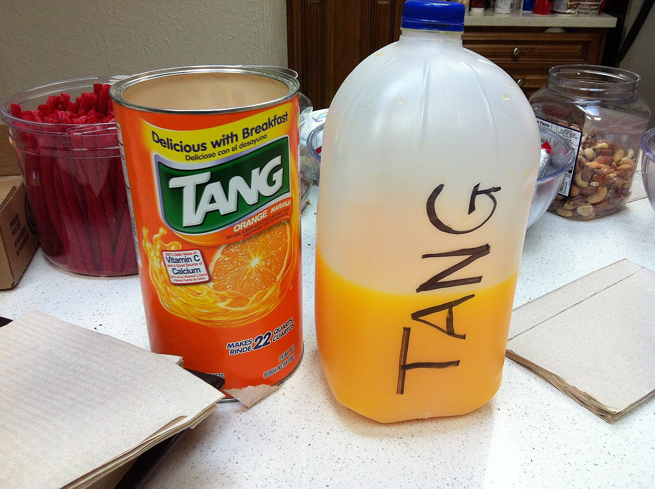
Few packs capture optimism like Tang, bright shelves and framed as science in a jar. A 1966 ad artifact preserved by The Henry Ford says Tang was chosen for Gemini astronauts and used on American space flights since Gemini IV. That line gave the package instant authority and turned a drink mix into a badge of modern living.
The overhype now comes from treating the jar as proof of better taste or better nutrition. The real draw was symbolic: families could buy something that looked connected to national ambition and technical progress. It was brilliant positioning, and awkward in hindsight. The package looked authoritative on a crowded shelf.
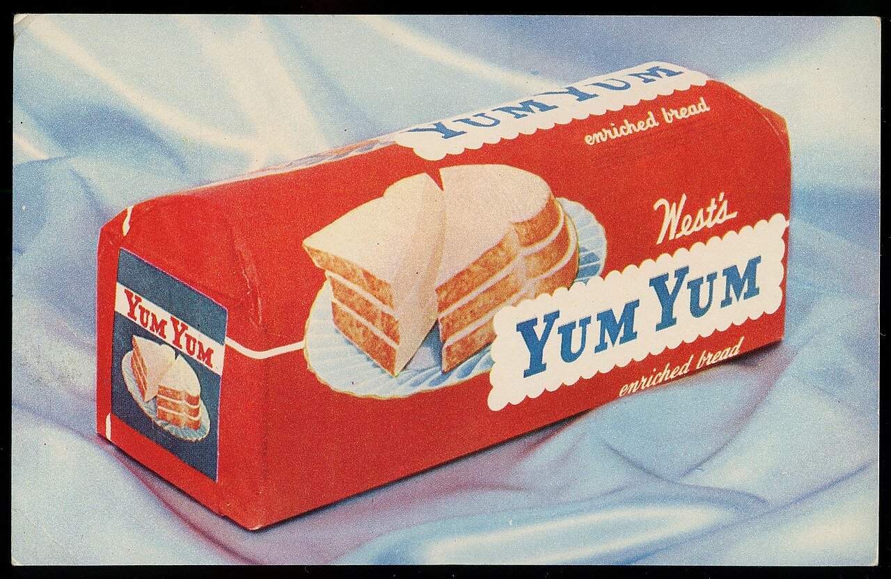
Pop-Tarts Boxes That Sold Convenience as Culture
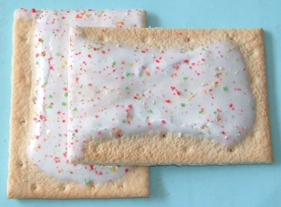
Pop-Tarts reached stores in 1964 and quickly became a packaging story as much as a snack story. Brand history tracks development in 1963 and launch in 1964, while later reporting notes colorful packs and mascot campaigns, including Milton the Toaster in 1971. The box came to stand for speed, sweetness, and new breakfast identity built for busy households. It felt playful and efficient at once.
What nostalgia edits miss is how tightly that design targeted behavior. Bold visuals signaled fun, while the shelf-stable format normalized eating on the go before that phrase became mainstream. The package did not just hold food. It coached routines.
Cool Whip Tubs That Made Dessert Look Effortless

Cool Whip launched in 1966 as an alternative to homemade whipped cream, and the tub became a fixture of American dessert culture. Kraft Heinz timeline notes that 1966 origin as a core milestone, and the package signaled reliability: open, spoon, serve. For busy households, the tub felt practical and predictable.
The awkward part of current overhype is not nostalgia itself. It is the tendency to frame convenience packaging as pure romance without naming why it worked: consistency, storage life, and labor saved. The tub succeeded because it reduced effort, not because it looked vintage. It matched the era’s faith in convenience foods.
Campbell Soup Cans Turned Grocery Shelves Into Pop Art
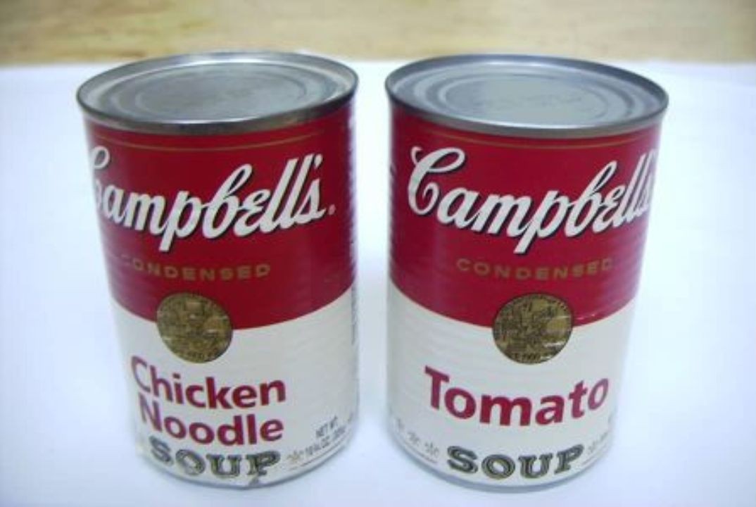
Campbell’s red-and-white can began before the 1960s, but that decade sealed its cultural status. Company history traces the label look to 1898, and MoMA documents Warhol’s 1962 Campbell’s Soup Cans as a Pop Art landmark. By then, the package had moved from pantry object to design symbol, so it still dominates retro food edits. That weight still lingers.
Nostalgia flattens ordinary shopping life. Standardized packaging boosted recognition and trust, yet it also encouraged snap decisions driven by familiarity. The can became iconic because it was everywhere, not because every can carried equal quality or value. Brand memory did the work.
Early Pull-Tab Cans That Felt Ingenious Until the Mess

Early pull-tab cans are often presented as flawless convenience, and the excitement was understandable. Smithsonian reporting tracks Ermal Fraze’s pop-top path in the early 1960s, which removed the need for separate openers and changed daily routines quickly. That single metal motion felt like clear progress in packaging design and everyday ease.
The problem came right behind the innovation. Ball’s can timeline notes the stay-on tab arriving in 1975, a fix that followed years of detached tabs and cleanup headaches. What looks charming in retro clips once had a practical downside people dealt with in parks, cars, and kitchens.
Pre-1990 Boxes That Look Clean but Tell Less
Many 1960s packages look sharp online because front panels were visually simple: strong logos, mascots, and color blocks with less nutrition detail. Smithsonian research on food culture and supermarkets explains how packaging steers choices, and mid-century boxes were built to catch attention first. The clarity was real, but so was the information gap.
That gap matters in hindsight. IFIC’s label history notes nutrition information was not always required before the 1990 law and standard Nutrition Facts panels appeared later, in 1994. The design looked cleaner partly because consumers were being told less at the point of purchase.