
Fashion rules often sound like timeless wisdom, but many were built for old social codes rather than modern life. They came from department-store etiquette, class signaling, and office norms that treated style as obedience. When those rules are repeated for decades, they can feel like facts, even when they block better choices.
Today, fit, comfort, climate, and personal context matter more than inherited commandments. A polished look still needs intention, but it does not need outdated restrictions. The strongest wardrobes are usually edited with logic, not fear, and shaped by how people actually move through real days now.
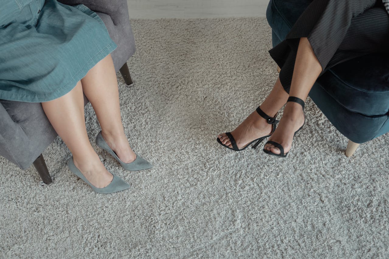
Never Mix Black and Brown

That rule came from older dress codes that prized obvious matching, especially in menswear and office settings where belts, shoes, and bags were expected to align. The goal was visual order, not creativity, so black and brown were treated like rivals instead of neutrals that could share space.
Modern styling treats them as a strong pair when tone and texture are intentional. Deep espresso leather with true black wool can look sharp, grounded, and expensive. The real mistake is muddy contrast, not the color combination itself. A clean silhouette and one anchor piece, such as a coat or shoe, make the mix feel deliberate now.
No White After Labor Day

This rule was less about weather and more about social signaling in the United States. White once carried associations with summer leisure and resort wardrobes, while darker tones signaled the return to work routines. Over time, that etiquette survived long after the social meaning faded.
Now fabric weight and styling matter far more than the date on a calendar. Cream denim, ivory knits, and winter-white coats look refined in cold months, especially with camel, charcoal, or black. Seasonal dressing still exists, but texture leads the decision. The month does not decide whether white works. Construction, proportion, and context do.
Denim Is Too Casual for Polished Settings

Denim used to be coded as workwear first, then weekend wear, so many closets kept jeans outside anything considered dressy. That made sense when cuts were stiff, fades were heavy, and tailoring options were limited. The fabric carried a fixed meaning that older dress culture rarely questioned.
That meaning changed as fits improved and washes became cleaner. Dark straight or wide-leg denim with a structured blazer can read more polished than cheap trousers. Many offices and social settings accept jeans when they are neat and well-fitted. The difference is execution, not fabric alone. Clean hems and shoes lift denim into polished territory.
Fashionable Shoes Must Be Uncomfortable
For years, pain was framed as proof of elegance, especially in formalwear. A shoe that pinched was described as normal, and many people learned to expect blisters as the cost of looking put together. That idea survived because discomfort was treated as discipline, not design failure.
Footwear design has moved forward, and style expectations moved with it. Better cushioning and smarter construction now exist across price points, including formal options. Comfort does not weaken a look. It improves posture and presence, which often makes an outfit read sharper. A good shoe supports movement, then adds visual character with ease.
Do Not Mix Prints
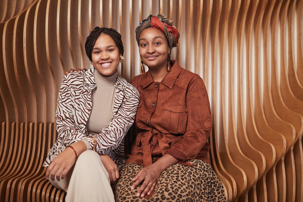
The no-print-mixing rule came from a fear of visual noise and a preference for safe dressing. It taught people to treat patterns like hazards that must stay isolated. That approach produced predictable outfits and discouraged experimentation, even when pieces already shared color or mood.
Print mixing works when there is structure behind it. A large floral with a narrow stripe can feel balanced when palette and scale are coordinated, and one pattern clearly leads. Texture can also quiet bold motifs, making the outfit feel coherent instead of busy. The goal is rhythm, not randomness. Clear hierarchy keeps mixed prints intentional.
Horizontal Stripes Are Unflattering

This rule spread because it offered a simple answer to a complex topic: proportion. It also carried a hidden assumption that width is always undesirable, which says more about body anxiety than style logic. As a result, many people avoided one of the most enduring patterns in everyday fashion.
In practice, stripe width, spacing, contrast, and garment cut matter more than direction. A well-fitted horizontal stripe can broaden shoulders in a balanced way and make the waist appear more defined. Vertical lines are not automatically slimming, and horizontal lines are not automatically widening. Fit, drape, and composition do more work.
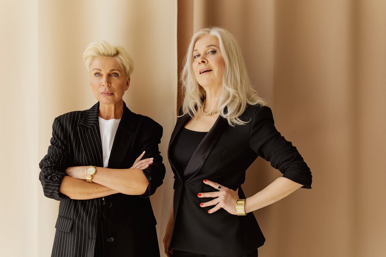
Navy and Black Clash

Navy and black were once treated as near-miss colors that looked accidental together. That judgment came from strict matching culture, where contrast needed to be obvious and color families were kept separate. If tones were close, they were labeled wrong instead of subtle.
Today, navy and black are a standard pairing in modern wardrobes. The combination works best when one shade leads and texture creates separation, such as matte wool with smooth leather. A light connector piece, like a white shirt, can sharpen contrast. The result looks controlled and quietly sophisticated when composition is intentional. It is subtle, not uncertain.
Accessories Must Match Exactly
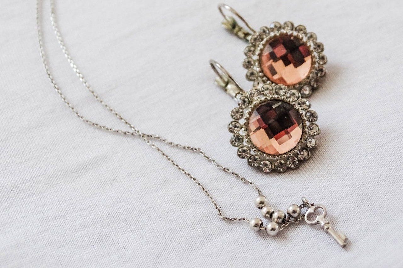
Matching every accessory was once promoted as the hallmark of being well dressed. Shoe, belt, and bag sets were sold together, and etiquette reinforced that uniformity as proof of polish. It simplified shopping, but it also flattened personal style into repetition.
Current styling favors coordination over duplication. Metals can mix, leather tones can vary, and bags can complement rather than mirror footwear. Cohesion comes from repeating one or two signals, such as shape, finish, or undertone, not from copying each item exactly. That shift gives outfits more depth and makes wardrobes easier to build over time without forcing perfect sets.
Certain Colors Are Off-Limits for Certain People
Old color rules often claimed to protect people from looking washed out, but they usually narrowed expression more than they helped. Many were delivered as absolutes tied to age, skin tone, or hair color, leaving little room for nuance. The message was restrictive even when it sounded practical.
Color is more adaptable than those rules suggest. Temperature, saturation, fabric sheen, and placement can all change how a hue behaves near the face. A bold tone can appear balanced in a smaller piece, while a softer version can work head to toe. There is no universal ban list. Testing value and undertone in natural light beats rigid color myths.
Dress for Success Means Dressing Like Someone Else
Traditional career advice often pushed people toward a narrow uniform of authority, regardless of industry or role. It helped some navigate formal offices, but it also encouraged costume dressing that felt disconnected from daily work. Many ended up looking correct on paper and uncomfortable in practice.
Professional style now leans toward credibility through fit and context. A clean silhouette, quality fabric, and appropriate footwear often communicate competence better than borrowed archetypes. The aim is not imitation. It is alignment between role and environment. When clothes support real work, confidence reads as clear and natural.