A room rarely feels expensive because of one big purchase. It reads as elevated when surfaces catch light differently, when hands notice softness, grain, and weight, and when nothing looks flat or flimsy. Texture does that quiet work, adding depth that photographs well and feels even better in real life. In late-afternoon light or on winter evenings, small shifts in shadow make spaces feel calmer and more composed. Simple layouts gain presence when materials feel varied. The best upgrades do not shout; they layer, balance matte with sheen, and make everyday objects look intentional, cared for, and built to last, too.
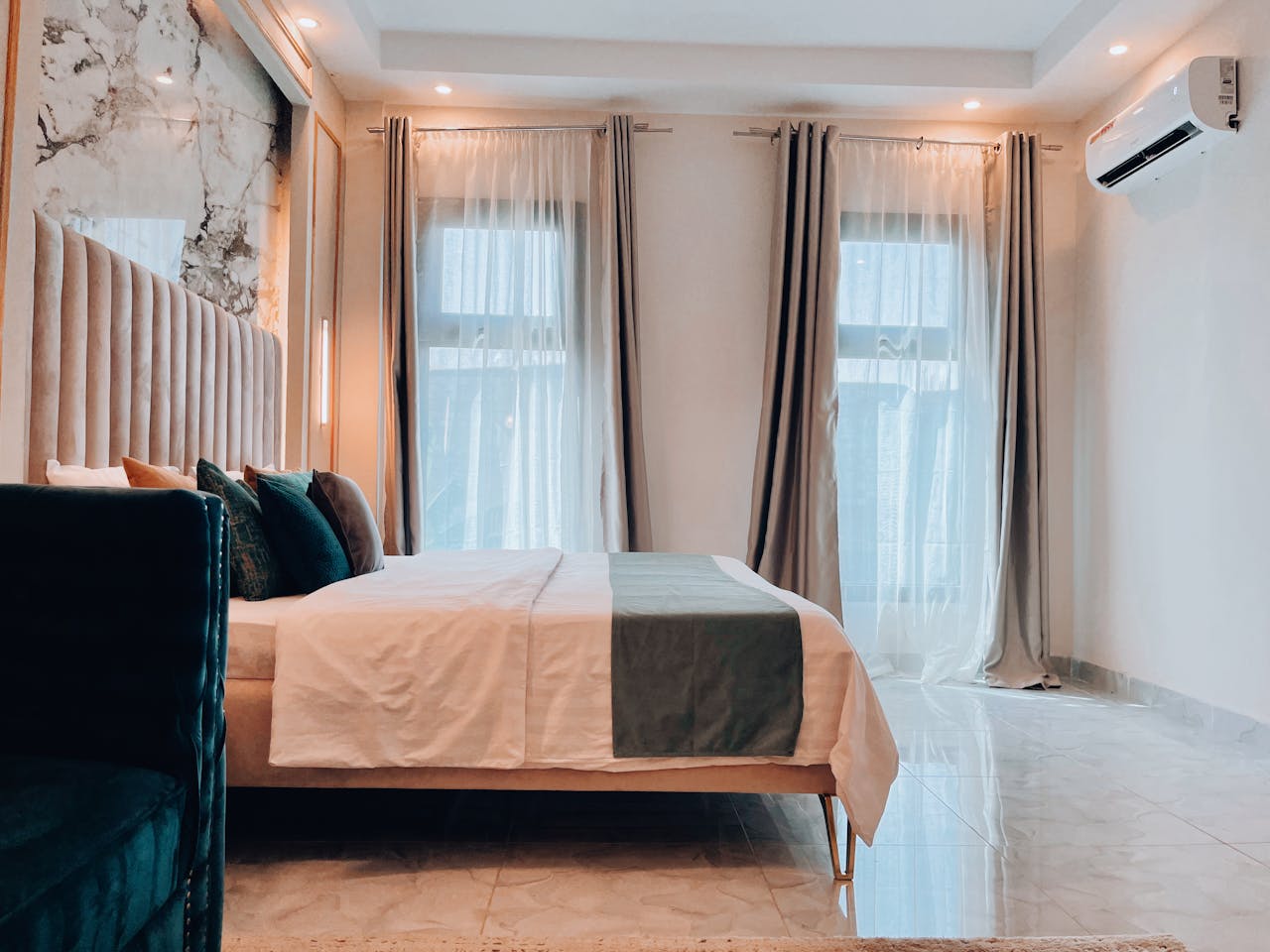
Layered Window Treatments With Linen Weight
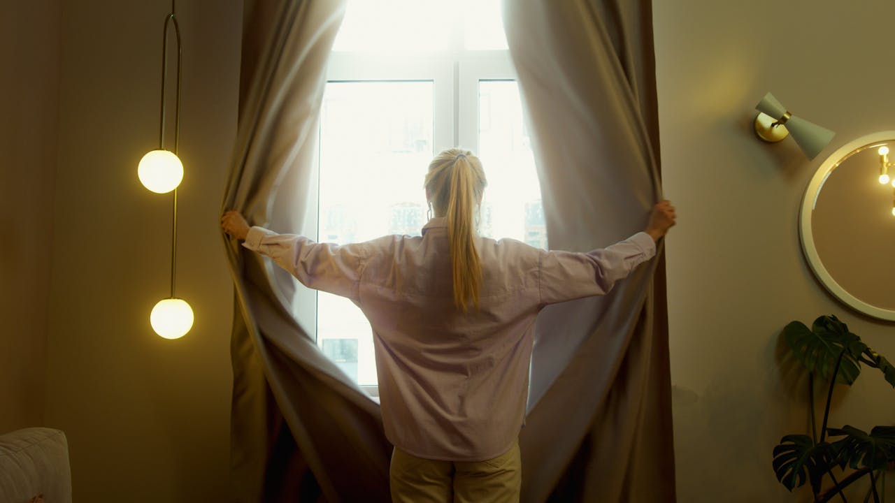
High-end rooms rarely stop at a single panel; they build a soft foreground and a quiet backdrop that changes with daylight and adds privacy without heaviness. Pair a tailored shade with linen-blend drapes so the weave diffuses glare, adds subtle slub, and makes the window feel framed like architecture; pinch pleats or ripple folds keep lines clean. Add a proper lining for body, choose hardware that feels weighty, hang the rod close to the ceiling and wider than the trim, and let hems skim the floor so the whole wall reads taller, while layered light control makes mornings brighter and nights darker quietly on purpose.
Plaster-Like Paint and Limewash Effects
Walls look pricier when they have movement, not shine, because light has something to land on besides a flat coat of color, the way it does in older plastered homes. A limewash, mineral paint, or plaster-effect finish creates gentle clouding that shifts through the day; it hides minor bumps, softens hard corners, and makes the room feel quietly historic without looking themed. Test a sample board first, embrace slight variation instead of perfect coverage, and keep the palette restrained and matte; with crisp trim, warm lamps, and clean ceilings, the texture reads artisanal, breathable, and deliberately composed.
Natural Fiber Rugs With a Visible Weave
A room feels richer when the floor has a real, visible weave instead of a printed pattern pretending to be texture, because the eye reads depth before it reads color. Wool loops, flatweaves, sisal, or a jute blend add quiet variation underfoot, hide everyday crumbs and scuffs, and ground furniture so it looks anchored rather than perched on top of a glossy surface. Stay in tonal color families, size up so front legs sit on the rug, and use a thick pad; clean binding, low-contrast patterning, and confident scale reduce visual noise while making the room feel settled; a basket weave can read as tailored as good carpet.
Real Wood Grain in Small, Strategic Places

Even when big pieces stay the same, real wood grain can shift the whole mood of a room, bringing in the kind of warmth people associate with older, well-kept homes. A solid-wood side table, a veneer-front cabinet with a clean edge, or shelves in oak or walnut adds depth because the grain changes slightly from board to board, not in a repeating print. Look for eased edges, aligned seams, and a finish that feels dry, not plasticky; repeat one tone in two or three spots, mix it with painted pieces for contrast, and avoid competing wood colors so everything feels curated, not assembled there, even a small tray helps.
Stone and Marble Accents That Feel Honest
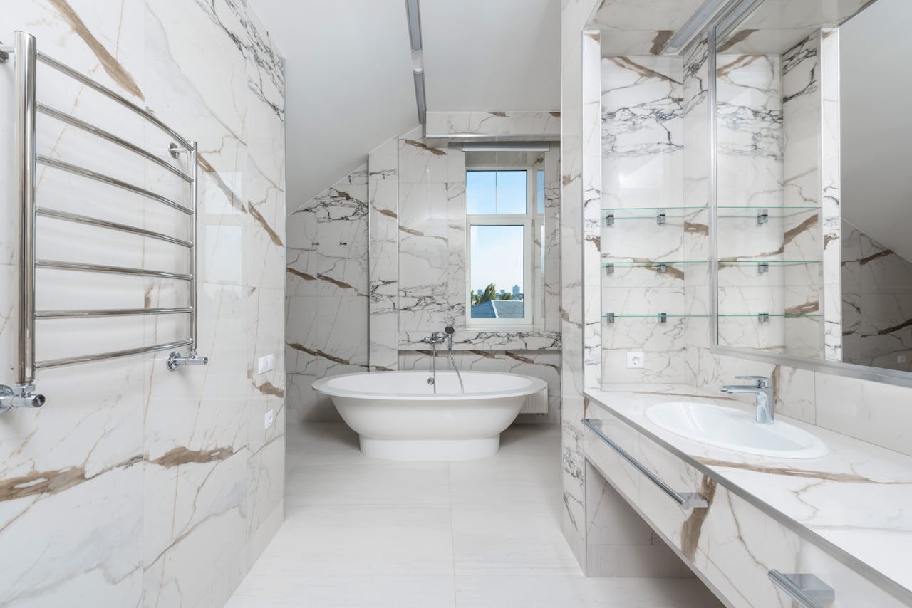
Stone reads as luxury because it is heavy, imperfect, and hard to fake convincingly; it brings a quiet sense of permanence to everyday surfaces. A marble catchall, a travertine lamp base, soapstone bookends, or a stone-topped side table adds veining, soft color shifts, and tiny pits that make nearby glass, wood, and metal look more intentional. Choose honed over high-gloss, keep scale modest so it feels like a refined accent, and limit the room to one stone family; placed on an entry console, nightstand, or coffee table, that cool touch and natural variation do most of the work without adding clutter or fuss at all.
Metal With Patina, Not Mirror Shine
Mirror-shiny metal can feel harsh, but brushed and aged finishes add depth the way good jewelry does, catching light softly instead of flashing it back. Unlacquered brass, aged bronze, and blackened steel look especially expensive on touch points like cabinet pulls, faucets, lamps, and curtain rods because the finish has visual weight. Match undertones to the room’s palette, limit the mix to one warm metal and one dark metal, and pick thicker profiles that feel substantial in hand; the slight patina hides fingerprints, softens with use, and only gets better over time without bright chrome or thin, plastic-y shine ever.
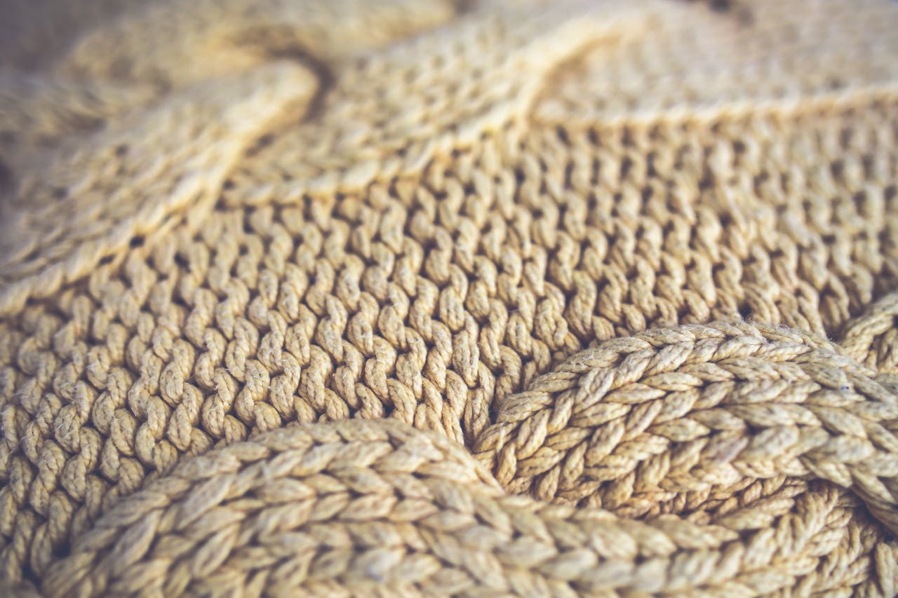
Chunky Knit and Bouclé for Soft Contrast
Soft, nubby textiles are the fastest way to make a room feel upholstered and thoughtful instead of slick and spare, because they add shadow even when the color stays quiet. A bouclé accent chair, a textured ottoman, or a chunky knit throw brings depth that balances smooth wood, glass, and painted walls; it also makes seating look more inviting and substantial. Choose tighter weaves that resist snagging, keep silhouettes clean, and let one hero piece carry the texture while a smaller echo shows up in a pillow or bench; the room reads layered, cozy, and intentionally finished in every season, as evenings turn cool.
Textured Wall Art and Framed Fabric Panels
Expensive rooms treat art as material, not just imagery, so walls gain shadow and structure at a glance and the space feels finished even before furniture does. Relief prints, woven pieces, ceramic tiles, or framed fabric panels add dimensional texture, soften acoustics, and catch sidelight in a way flat posters never will. Choose fewer, larger works with generous mats and substantial frames, keep a consistent hanging line, and add a picture light or nearby lamp so texture shows at night; leaving negative space makes the collection feel edited, not crowded; a vintage textile behind glass can look museum-ready with no fuss.
Elevated Bedding and Upholstery With Depth
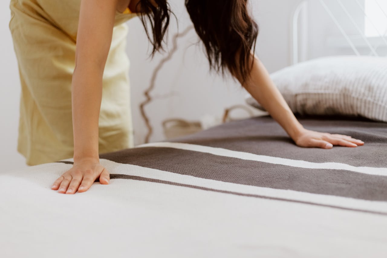
Luxury shows up most at touch points: bedding, cushions, and seating, because these are the materials people notice first and remember longest. Washed cotton percale, brushed linen, velvet, or dense chenille adds depth without loud pattern; paired with full inserts, tight welting, and straight seams, even simple shapes look tailored. Layer a matte coverlet with a textured throw, keep colors in the same family, and upgrade what sits inside covers as much as the covers themselves; when textiles feel weighty, springy, and well-finished, the entire room seems calmer and more expensive from the sofa to the bed at once.