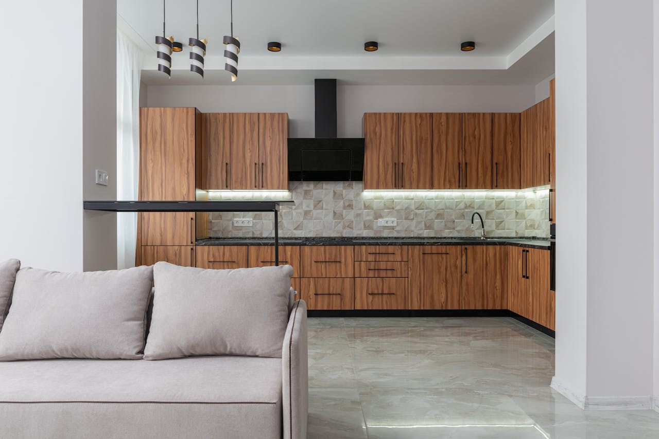
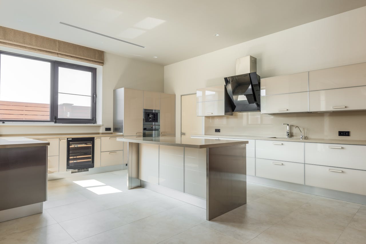
A 1990s kitchen can look functional at first glance, yet certain choices quietly lock it to a very specific decade. Many upgrades were marketed as practical and upscale, but they often added cleaning work, stole storage, or created visual noise that modern kitchens avoid. The result is not one dramatic mistake. It is a stack of small decisions that age together, from lighting that flattens color to surfaces that never wipe fully clean. Seen in hindsight, these details explain why so many remodels start in the same places and end with the same sense of relief.
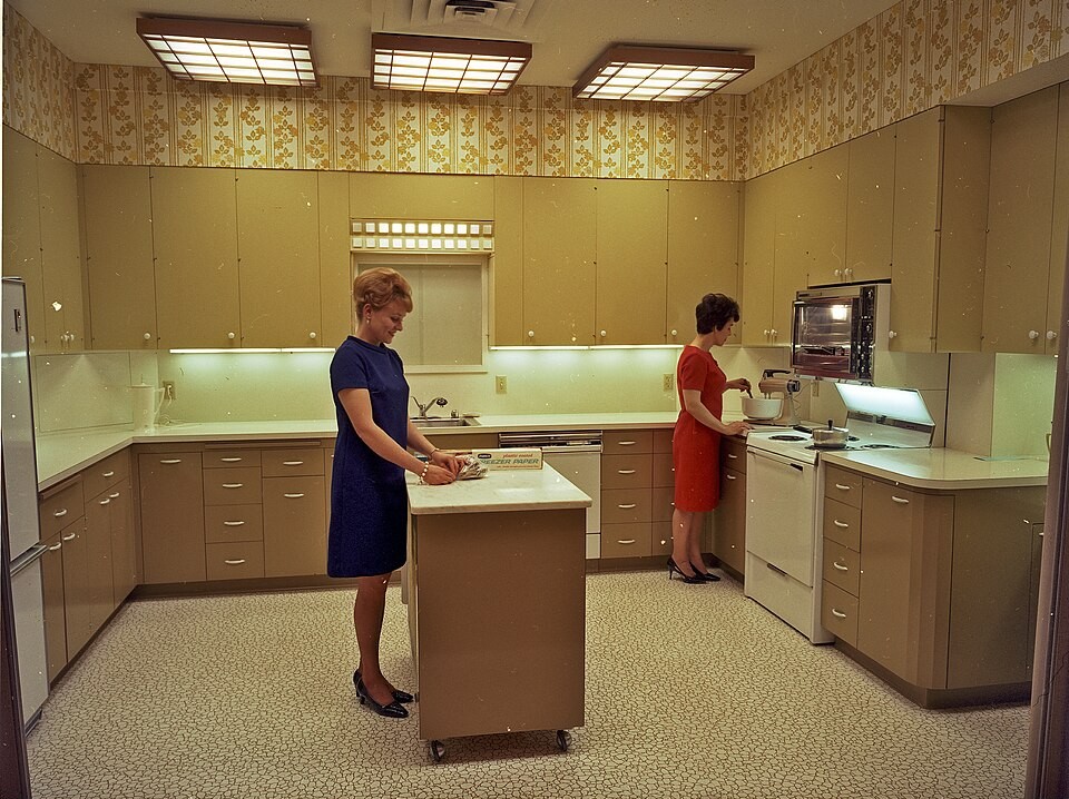
Honey Oak With Orange Stain
Honey-oak cabinets aged fast because the orange cast fought nearly everything around it, from speckled counters to beige floors, and it looked even warmer under cool fluorescent light. The finish also telegraphed wear: darkened handholds, glossy patches on raised areas, and tiny dings that showed up as soon as a kitchen got real use. Because the tone pulled the whole room toward yellow, even a spotless space could read tired. Homeowners often tried to balance it with busier counters or brass hardware, which only anchored the look deeper in the decade and made later updates feel mismatched.
Raised-Panel Doors With Deep Profiles
Arched, raised-panel cabinet doors were sold as upscale, but the deep grooves created a cleaning problem that never went away. Grease mist settled into the curves near the range, dust clung to bevels, and grime collected where a flat cloth could not reach in one pass, so cabinets rarely looked freshly wiped. The extra shadow lines also made the room feel darker and busier, so people compensated with brighter bulbs, shinier knobs, and glossy faucets, which spotlighted the dated door shape even more. Once taste shifted toward calmer surfaces, those profiles started reading heavy and fussy, even in an otherwise well-kept kitchen.
Tile Countertops With Wide Grout
Tile countertops promised durability, yet the grout lines became a daily maintenance tax that newer solid surfaces quietly eliminated. Crumbs lodged in seams, coffee and sauce tinted grout, and hairline cracks formed around sinks, so wiping never felt finished and scrubbing became routine. Even when tiles stayed intact, the surface was not truly smooth, which made rolling dough annoying and cutting boards wobble slightly. Because these counters were often paired with a matching 4-inch backsplash and busy patterns, the look locked the room into a specific era. When homeowners updated cabinets or paint, the grout grid still shouted 1997.
Boxy Soffits Above Upper Cabinets
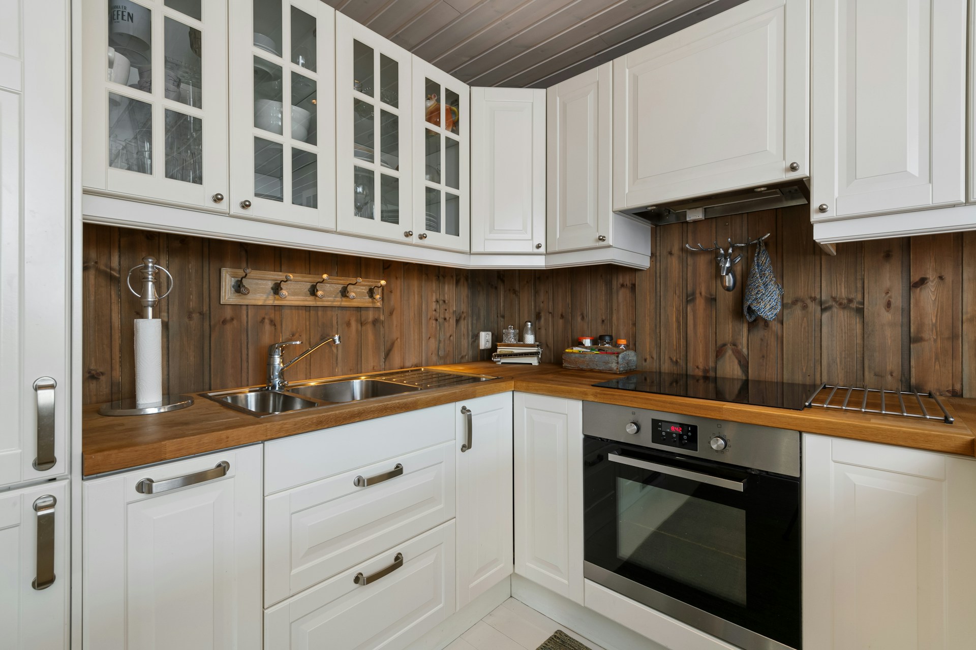
Soffits above upper cabinets were meant to hide ductwork and wiring, but they stole vertical storage and made decent-height rooms feel shorter. The dead ledge trapped grease and dust, creating a grimy band that was hard to reach and easy to ignore until it looked noticeably dark against the ceiling. Because soffits forced shorter cabinets, homeowners lost an entire top shelf of pantry space, then compensated with countertop canisters, baskets, and stacks of mail, which added clutter and visual noise. When remodels remove soffits and run cabinets to the ceiling, kitchens instantly feel taller and calmer, even before any new finishes arrive.
Fluorescent Box Lights That Flattened Everything
Large fluorescent ceiling boxes were pitched as practical, yet the light was harsh, flat, and unkind to finishes. It amplified the yellow in oak, turned whites slightly gray, and created one bright patch in the center while leaving corners and work zones in shadow, so cooking still required task lamps. Over time, tubes flickered, diffusers yellowed, and the fixture became a ceiling focal point for the wrong reason. The hum did not help either. Switching to layered lighting, like recessed cans, pendants, and under-cabinet strips, tends to feel like a renovation even when nothing else changes, because the entire room suddenly looks cleaner and more current.
The Built-In Kitchen Desk Nook
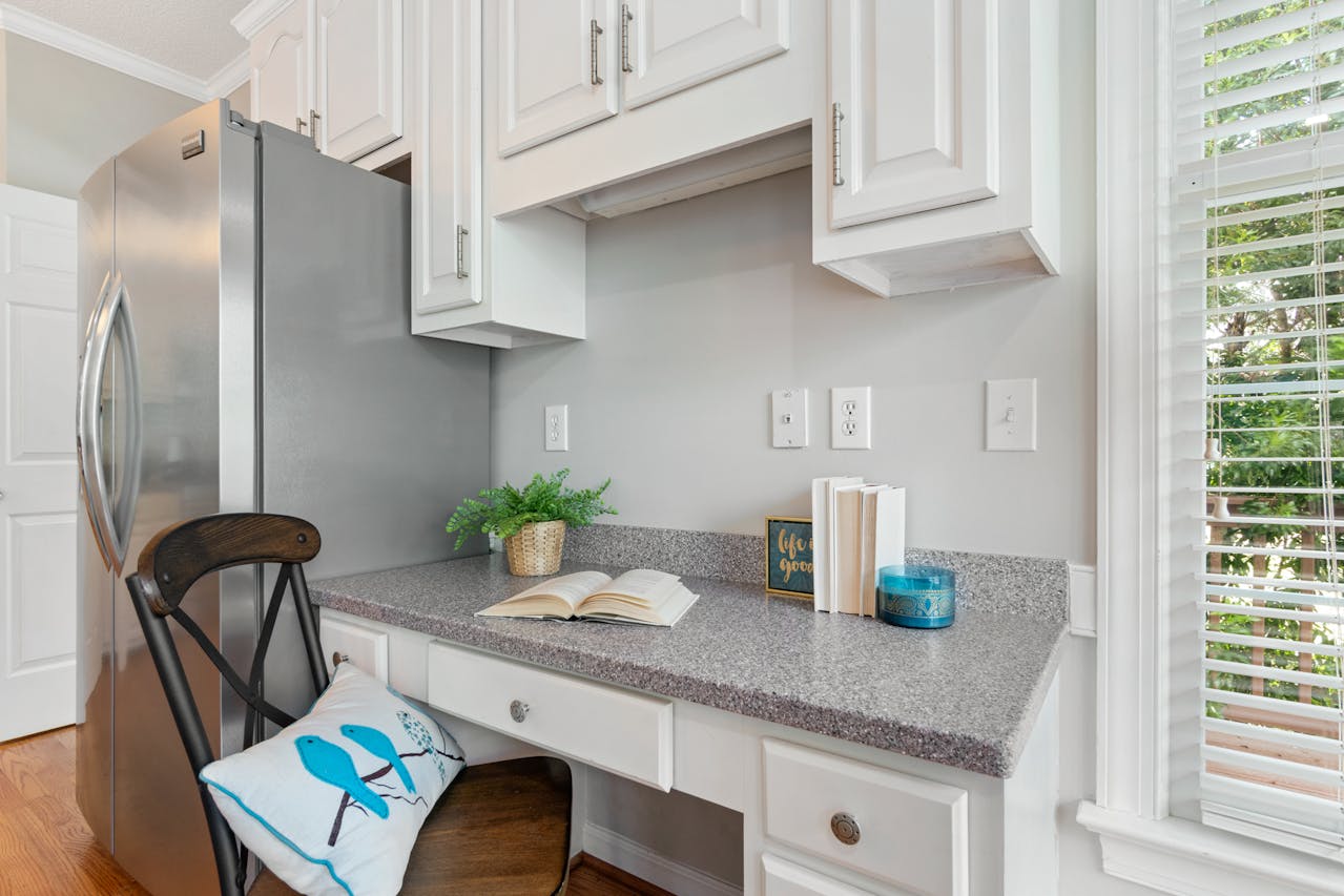
The built-in kitchen desk sounded like a smart command center, but it often became the fastest clutter magnet in the house. The surface was usually too shallow for real work, yet perfectly sized for mail piles, chargers, school papers, and small appliances that never found a better home. The surrounding cabinets were shallow, so storage never matched the mess, and the chair blocked traffic in an already tight aisle. Because the nook sat at eye level, it made a kitchen look perpetually unfinished, even when everything else was neat. That is why remodels often convert it into pantry space, beverage storage, or a clean counter run that actually gets used.
The Two-Level Peninsula Breakfast Bar
Two-level peninsula bars tried to hide dirty dishes from the living area, but the split heights created a surface that served neither job well. The raised ledge blocked sightlines, trapped crumbs in the seam, and made casual seating awkward because elbows never had a natural place to land. It also reduced usable prep space on the lower counter, so kitchens felt smaller than their square footage. The design encouraged clutter, too, since the back ledge became a shelf for paper, decor, and random bottles. A single-level island reads calmer, works harder, and photographs better, which is why flattening the bar is a common first move in a remodel.
Decorative Tile Borders And 4-Inch Splashes
A 4-inch backsplash with a decorative border was meant to add character, but it often chopped the room into stripes. The short splash did little to protect walls behind a range, and the border introduced more grout, more patterns, and more visual stops, so even a simple layout felt busy. Accent tiles were often floral, Tuscan, or rope-patterned, which clashed with later updates like modern faucets or fresh paint, making the kitchen look half-renovated. Once full-height backsplashes and simpler materials became common, the old border strip started to read like a time stamp, and removing it became one of the quickest ways to calm the room down.
Beige Sheet Vinyl With Loud Patterns
Patterned beige sheet vinyl was marketed as low maintenance, but the faux-stone swirls and speckles became the loudest thing in the room. Under fluorescent light the floor could look shiny and flat at once, and scuffs showed as gray streaks that never fully vanished, so the surface always felt slightly worn. The bigger issue was coordination: once the floor had a strong pattern, every other finish had to stay bland, trapping the kitchen in beige-on-beige decisions. When homeowners finally updated cabinets or paint, the floor instantly revealed the decade. Replacing it tends to unlock better choices everywhere else.