Maximalism only looks messy when a room has no rules. The best versions feel like a well-edited collection: bold, personal, and still easy on the eyes. Designers lean on quiet structure, then let color, pattern, and objects do the talking. Repetition creates rhythm. Scale keeps prints from fighting. Storage hides the everyday clutter that breaks the illusion. The trick is knowing where to go loud and where to leave calm air, so a space feels full without feeling crowded, always.
Pick One Hero Pattern And Let It Lead
Maximalist rooms look polished when one pattern clearly leads and everything else supports it. Designers choose a hero wallpaper, rug, or curtain print, then pull two or three colors from it for solids, art mats, and one painted accent, so the eye knows where to start. Smaller patterns can join in, like a stripe or tiny check, but they stay quieter in contrast and scale, with plenty of solid texture between them. The room feels layered, not loud, and the architecture keeps its voice. A good test is squinting: if the hero still reads and the rest melts into support, the mix will look intentional for years.
Repeat A Color Three Times
Color reads expensive when it shows up with rhythm instead of randomness. A strong shade like cobalt, rust, or olive looks intentional when it appears three times in different sizes, such as a pillow, a vase, and a framed print. Spreading those repeats across the room creates a clear route for the eye, so mixed patterns and mixed furniture feel connected. Neutrals like cream, tan, or charcoal can sit between repeats to keep the palette calm, preventing one color from taking over. The whole space keeps its pulse without feeling busy, and future pieces slot in easily because the color story is already written.
Mix Patterns With A Clear Scale Ladder
Pattern stacking looks good when scale is managed like volume. Designers build a simple ladder: one large print, one medium repeat, and one small tight pattern, then stop adding, so each layer has space to be understood instead of competing. A floral sofa can pair with a striped rug and a tiny check pillow when colors relate, because each pattern reads at a different distance. Solids and textures, like linen or velvet, act as quiet breaks, giving art and plants room to land without fighting. The result feels energetic, but the eye can still rest. If everything is medium-scale, the room buzzes; the ladder lowers the noise.
Use Closed Storage To Hide The Boring Stuff
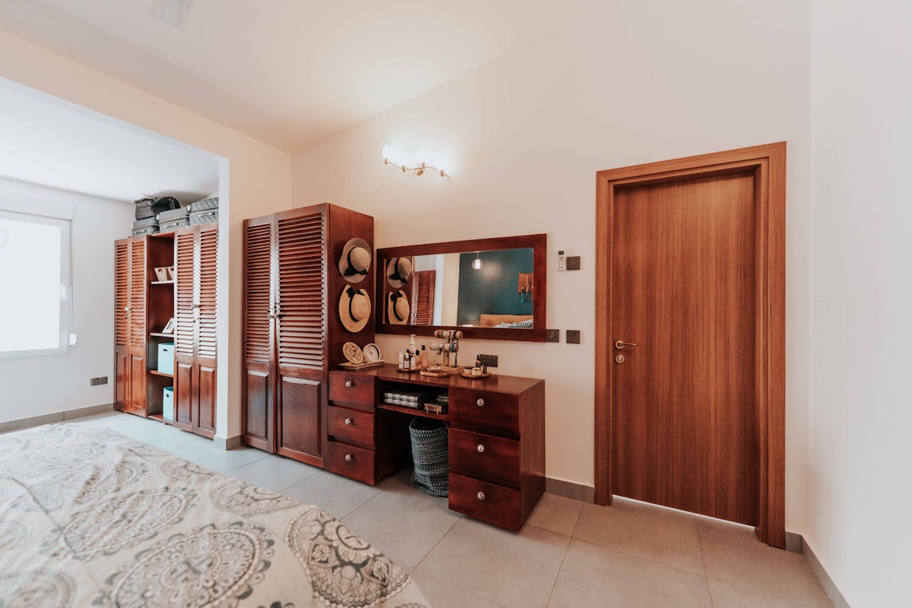
Great maximalism has a clean secret: the dull items disappear. Designers keep books, art, and favorite objects visible, but hide cables, mail, chargers, remotes, and packaging behind doors, drawers, or lidded baskets, so the eye sees curated layers instead of daily spillover. Once clutter is contained, bold decor reads as style rather than chaos, and surfaces feel intentional even when they are full. The room stays functional because everything has a home, and it can be reset in minutes with one quick sweep. Closed storage works best at eye level, so open shelves can hold only the pieces worth seeing every day.
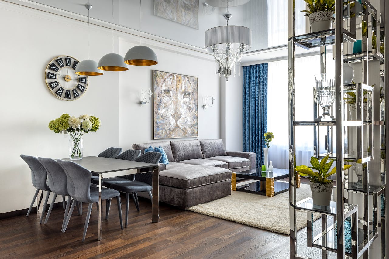
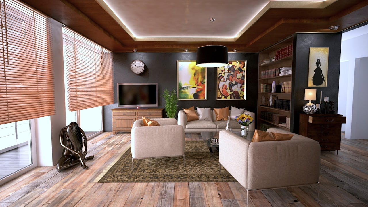
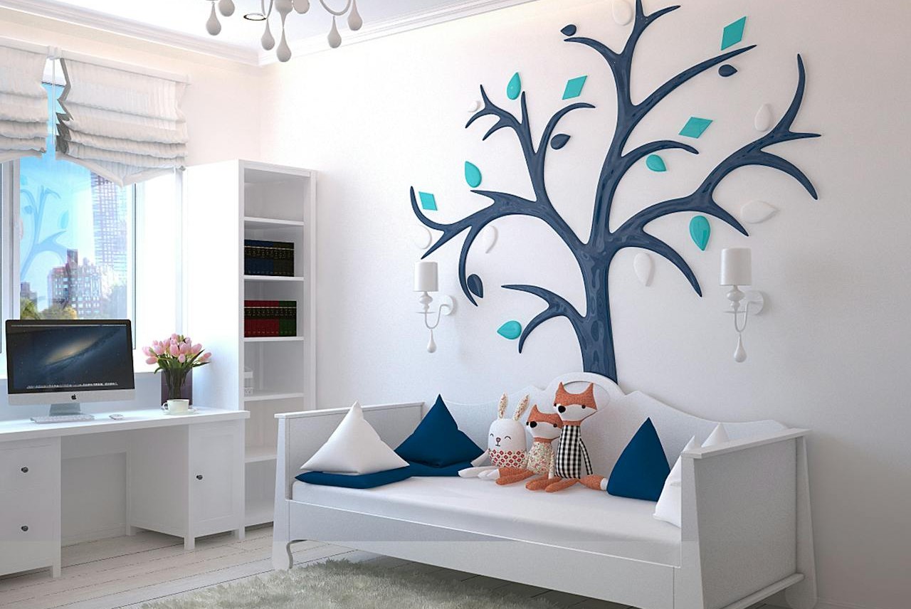
Create One Gallery Wall With A Strong Grid
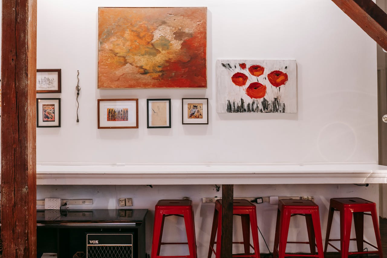
A gallery wall looks collected when it follows a clear structure. Designers either commit to a tight grid of same-size frames or build a salon wall anchored by one large piece, then keep spacing consistent and align key edges so the arrangement reads calm from across the room. Mixed art styles can live together because the layout provides order, and repeating one frame finish or mat tone adds unity without flattening personality. The wall absorbs visual energy, making the rest of the room feel quieter, not emptier, and it gives small spaces a confident focal point. It also makes swaps easy, since new art follows the same spacing rule.
Layer Lighting Like A Set Of Instruments
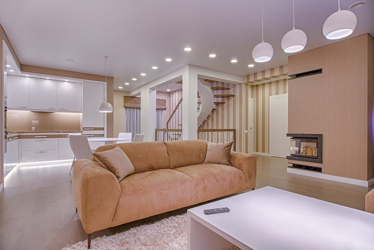
Maximalist rooms feel richer when lighting is layered instead of relying on one bright ceiling fixture. Designers combine a statement pendant, a floor lamp, and at least one table lamp, then add an accent like a picture light or sconce to create calm pools of glow across the room and reduce harsh overhead glare. Layered light flatters color and pattern, makes objects feel placed on purpose, and keeps evenings warm rather than sharp. Warm bulbs and dimmers matter, because they let the room shift from lively to settled while keeping corners inviting. Good light also hides nothing, so clutter shows fast, which nudges better habits.
Use One Material As A Through-Line
Maximalism turns messy when every surface competes, so designers repeat one material as a steady thread. Brass, dark wood, rattan, or black iron can appear in lamp bases, frames, hardware, and table legs, giving the room a consistent language while prints and colors do their louder work. That through-line makes mismatched pieces feel related, like they were collected over years instead of bought in a rush. It is easy to build with small moves, such as matching pull finishes, repeating a frame color, or choosing two lamps with the same metal, then echoing it again in a mirror. The room reads cohesive even up close.
Go Bold On One Surface, Not All Four
Even bold rooms need restraint, and designers often put the drama on one main surface. A wallpapered accent wall, a painted ceiling, or a strong rug can carry the look while other planes stay calmer, so the space feels confident rather than overwhelming and the eye gets a clear focal point. Concentrating the bold move also makes future changes easier, because the statement is simple to swap and the supporting pieces stay flexible. Calmer trim and larger solids keep the room from feeling like every corner is asking to be noticed, even when collections and pattern are layered. It is the difference between vibrant and exhausting.
Curate Collections By Color Or Category
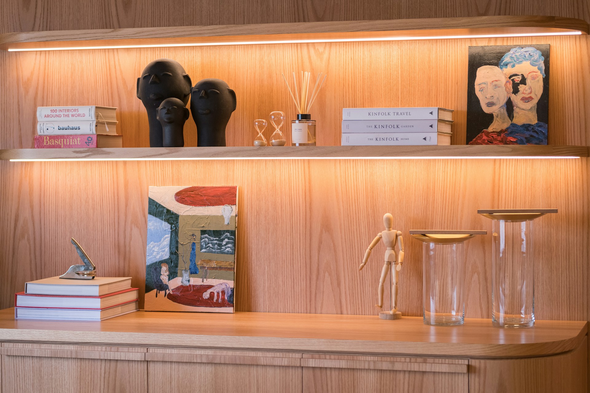
Collections look intentional when they follow one simple rule. Designers group items by color, material, or category, like ceramics together, glass together, or books arranged by tone, which creates order inside abundance without looking stiff. Leaving small gaps matters, because breathing room keeps shelves from feeling stuffed and helps each object read as chosen. Repeating shapes, like a run of round vessels or a set of frames, adds calm structure, while varied heights and a few stacked books keep it human. The display becomes a feature, not a pile. A tray or riser can group small pieces so they read as one moment.
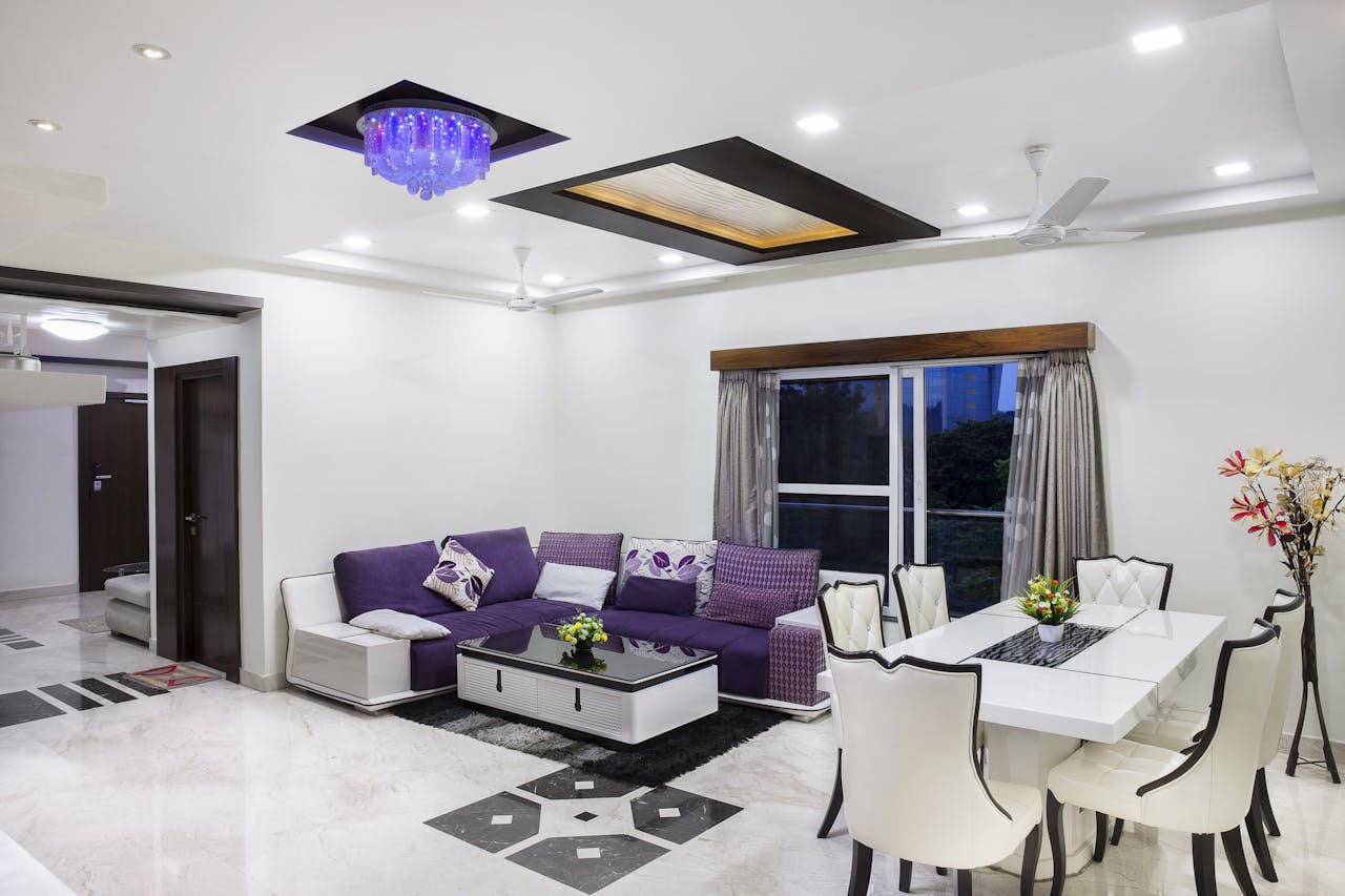
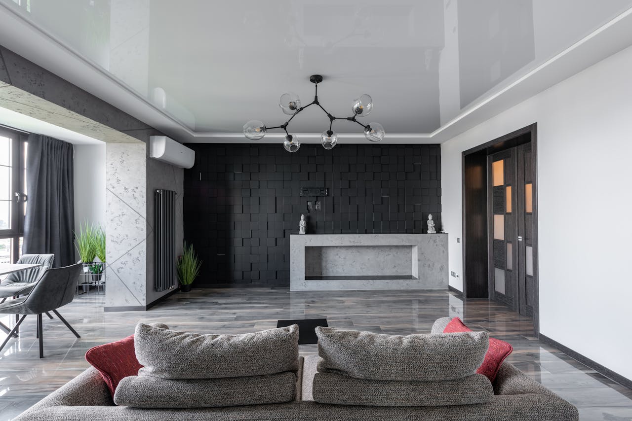
Add One Oversized Piece To Calm The Room
One oversized piece can settle a maximalist room better than ten small accents. Designers use a large mirror, big art, a tall bookcase, or a substantial sofa to anchor the space, giving the eye a resting place while patterns and objects layer around it. Proper scale makes the room feel cleaner, because fewer items have to fight to be seen. A correctly sized rug can do the same, pulling furniture into one clear zone so the layers look intentional rather than scattered. Smaller objects work best in clusters, not sprinkled everywhere, so the room feels finished. Big scale brings calm, even in tight layouts.
Keep Negative Space On Purpose
Maximalism looks best when it includes breathing room on purpose. Designers leave a clear wall section, an open stretch of floor near a doorway, or a calm tabletop, so the layered areas feel chosen instead of packed and the room stays easy to live in. This is pacing, not minimalism, and it works because empty zones make bold zones look richer, guide movement through the space, and leave an honest place for keys, a coffee mug, or a book. When negative space is planned, the room feels relaxed on a normal weekday, not like it is always mid-styling. It also makes tidying simple, since there is somewhere to set things down.