Trends move faster than houses do, so dated décor often comes from a few loud choices repeated everywhere. It is rarely about taste; it is about details that lock a room to one era, then clash with every update around them. The fix is usually cosmetic: swap a finish, change a light, edit a pattern, or remove one overused accent. Most rooms look fresher the moment glare is softened and visual noise is reduced, even before new furniture arrives. When big surfaces stay calm and lighting stays warm, the home feels current without losing comfort. The goal is a backdrop that lets the best pieces feel chosen, not stuck in time.
Word Art And Script Quotes
Oversized cursive wall quotes in wood or vinyl timestamp a room to a very specific era, especially when they sit over a bed or sofa like a headline. The words are not the problem; the scale and font often replace real art, flatten the wall, and make the space feel staged. A cleaner move is to swap the quote for one strong photo, a simple abstract print, or a textured mirror. If words still belong, keep them small in a frame on a shelf so the room feels personal, not like a slogan. Pair it with a warm lamp and one living plant, and the wall starts telling a story again without shouting. The space reads calmer instantly.
Overly Themed Rooms
Rooms built from literal themes, anchors and rope for coastal, repeated landmarks for a city motif, or ski signs for a lodge look, can feel like décor purchased in one sweep. The eye starts scanning for props instead of noticing light, materials, and proportion, so the space loses depth and flexibility. To refresh it, keep one clear cue, like a seascape photo or a woven rug, then let texture do the rest with linen, warm wood, and simple ceramics. Editing down makes the room feel lived-in, not staged, and it stays relevant when tastes shift. Fewer symbols make everyday items, coats, books, shoes, look like part of the home instead of clutter.
Glossy Granite And Busy Backsplashes
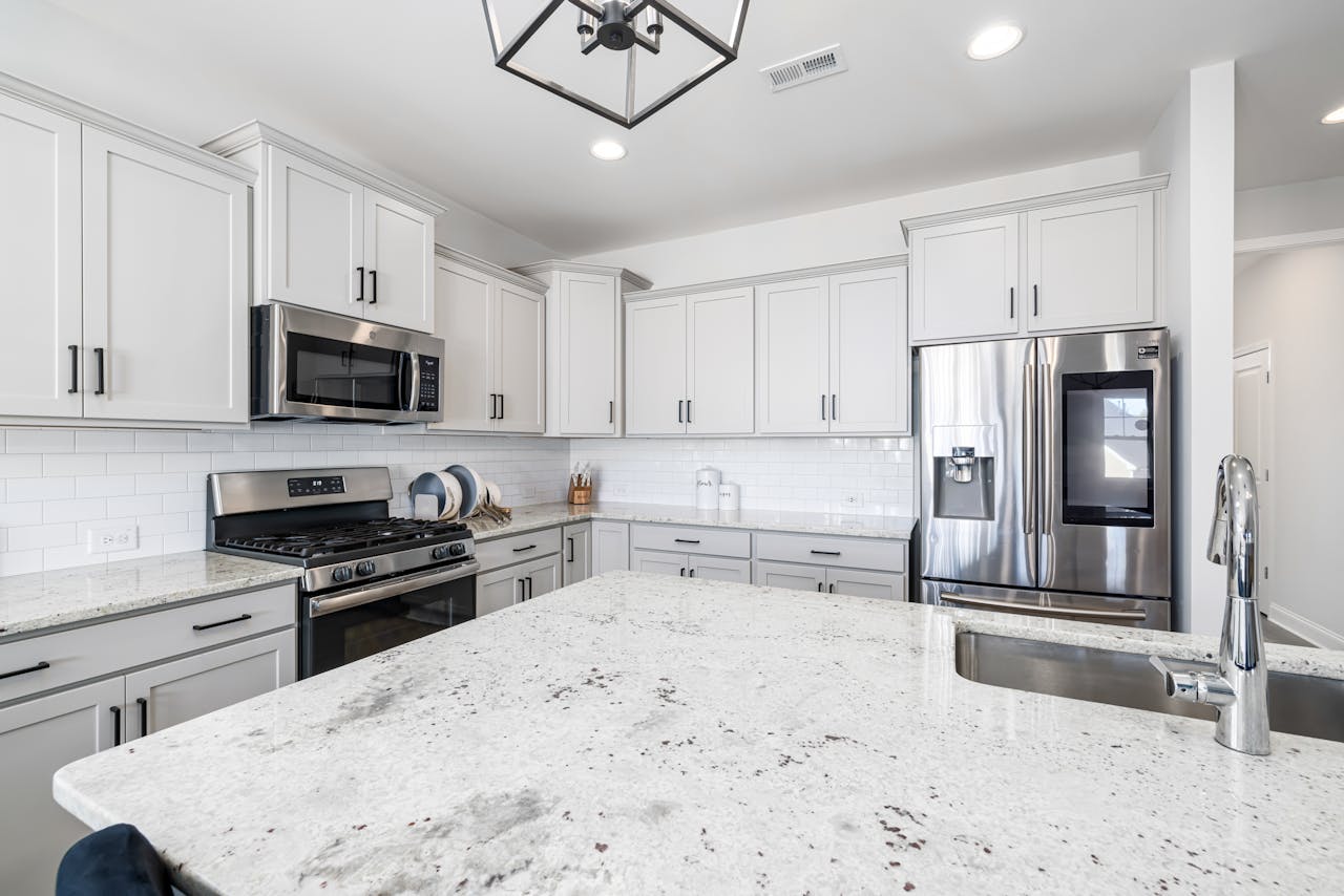
Speckled glossy granite paired with narrow mosaic backsplash strips once read as upscale, but the heavy patterning now signals early-2000s remodeling. Multiple small patterns fight cabinets, counters, and appliances, so the kitchen feels crowded before anything is left out, and even a toaster looks messy. A modern fix is quieter surfaces: honed stone or solid-pattern quartz, plus one simple tile field with clean grout lines. Keeping the layout the same while reducing visual noise makes the room feel newer, brighter, and easier to maintain. Warm under-cabinet lighting and simpler hardware finish the shift without a full renovation.
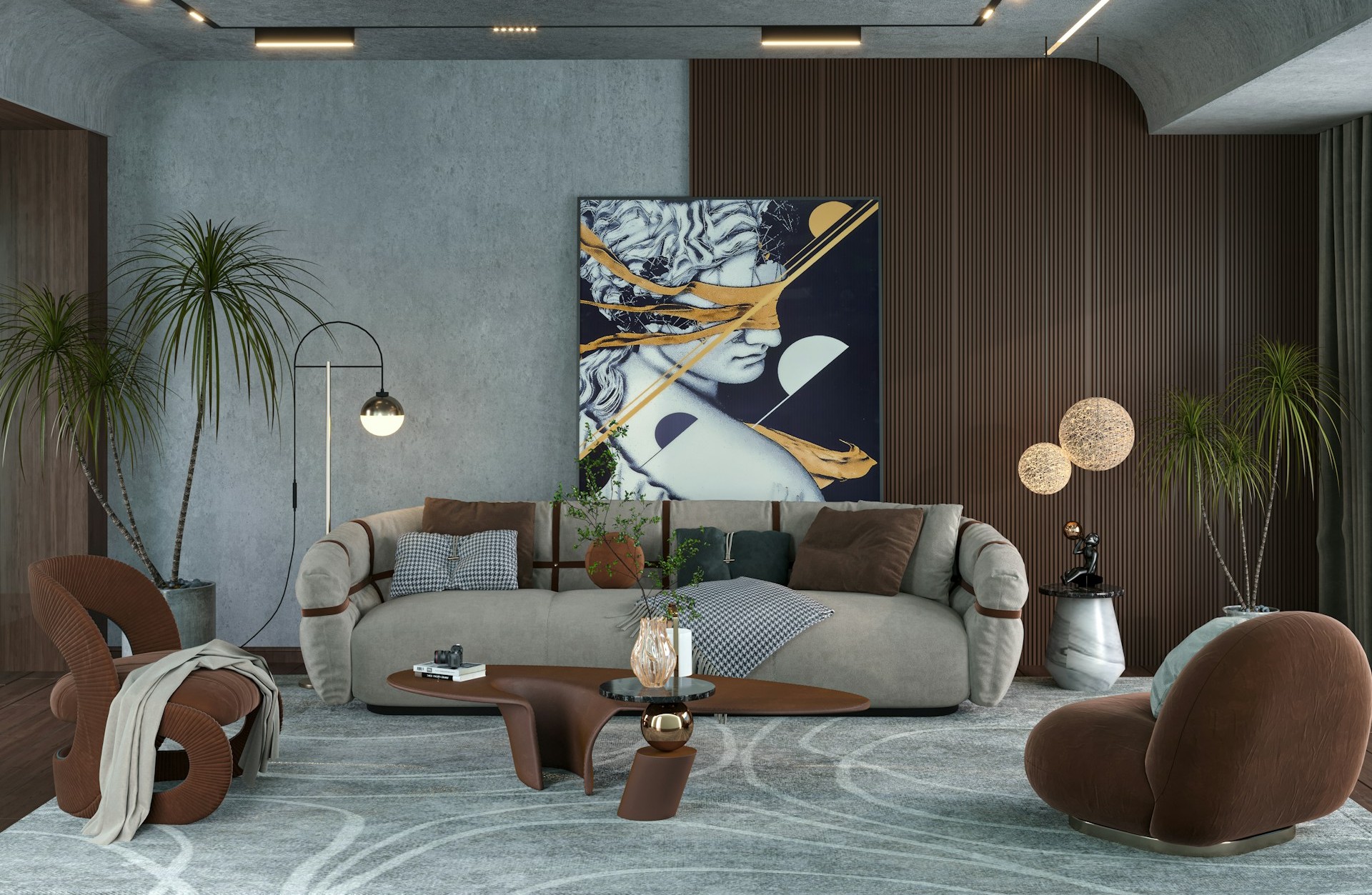
Matching Furniture Sets
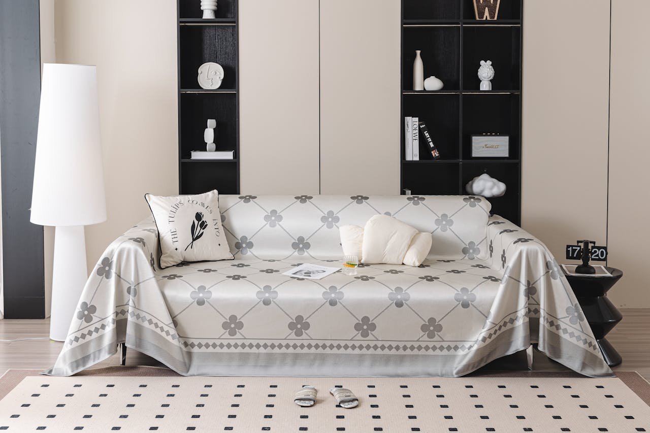
When the sofa, loveseat, chair, and tables all match in fabric and finish, the room can feel like a showroom display frozen in time. Sets were marketed as polished and easy, but they flatten character by repeating the same shape and tone everywhere, so nothing feels collected or personal. Breaking the set is usually enough: add one different chair silhouette, a wood coffee table, or a vintage side table with patina. Repeat that contrast once more with a textured rug or warmer lamp, and the space reads intentional, not prepackaged. The mix keeps the room flexible for future swaps without forcing a full matching purchase again.
Heavy Faux Finishes
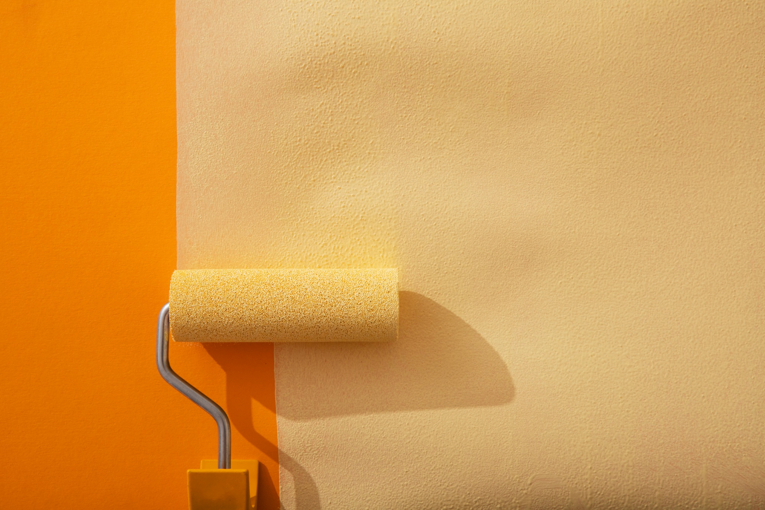
Faux finishes like sponge painting, rag rolling, and high-contrast marbling were popular because they added depth fast, but they announce their decade immediately. The technique pulls attention to the wall itself, looks busy from across the room, and can photograph harshly in both sun and lamplight. A simpler paint job, matte or soft eggshell in one color, reads cleaner and lets furniture and art carry the personality. If texture is still desired, plaster, limewash, or a tactile wallpaper gives depth that feels like material, not a visual trick, and it ages more gracefully. It also hides wear better.
All-Gray Everything
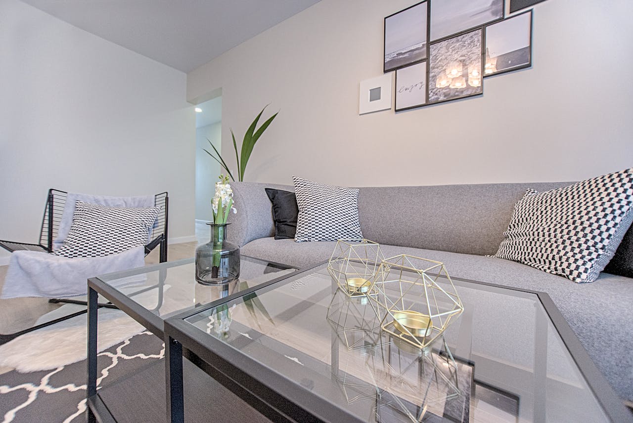
A room where floors, walls, and upholstery sit in the same cool gray band often reads like mid-2010s neutral minimalism, especially with blue undertones and bright white trim. Gray can be elegant, but when it dominates every surface it flattens contrast and can feel chilly under cool bulbs, giving a flip-house vibe. The update is not to ban gray, but to warm the mix: add wood tones, tan leather, creamy whites, and brass or bronze accents. Layered lighting and a single richer color, like olive or ink, restores depth so the room feels calm and lived-in again. Even one wool throw and a patterned rug can shift the temperature of the space.
Harsh Cool White Lighting
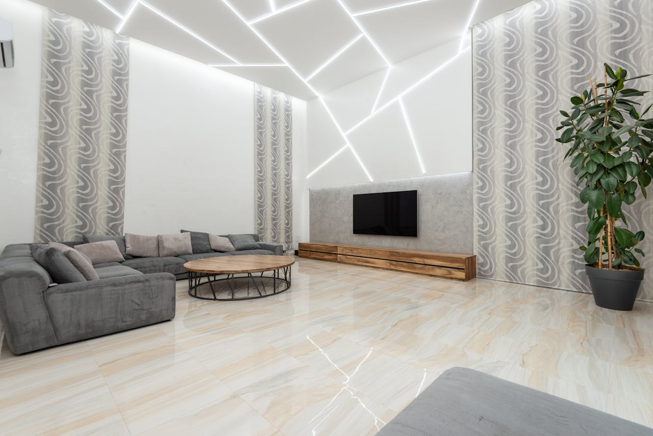
Cool white bulbs and blue-tinted LEDs can make a home feel sterile because they drain warmth from wood, skin, and paint, and they exaggerate glare on glossy finishes. They also sharpen shadows, so corners look harder and smaller, and photos turn flat or harsh even when the room is tidy. An easy fix is consistent warm bulbs across fixtures, plus dimmers where possible, so brightness can match the moment. Layer light at eye level with shaded lamps and sconces, and keep overheads softer, so colors look richer and faces look relaxed. Many homes land best around 2700K to 3000K, and matching tones prevents the room from feeling patchy.
Overstuffed Window Treatments
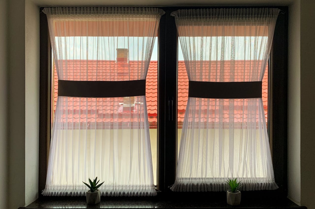
Heavy valances, shiny swags, and layered curtain stacks date a room because they block daylight and add formal weight that most spaces do not need. They can also visually lower ceilings when rods sit close to the frame, making the wall feel compressed, darker, and harder to keep crisp. A fresher approach is to hang rods higher and wider, use simple linen panels, or choose woven shades that filter light without fuss. Clean lines show off the window shape, brighten the room, and make furniture feel lighter, while also cutting down on dust-catching folds and constant adjusting. Simple hardware in one finish makes the update look intentional.