Midcentury modern still charms because it feels optimistic: warm woods, honest shapes, and rooms that breathe. Yet when every surface leans retro, the look can slide from curated to copy-paste. Overuse often shows up as sameness, visual noise, or materials that feel more costume than craft. The good news is that midcentury plays well with neighbors. A few edits, better proportions, and one or two unexpected textures can keep the era’s spirit while letting a home feel lived-in, current, and personal, not like a showroom set. Think of it as tuning the volume, not changing the song. The classics stay, the clichés go.
Everything Has Tapered Legs

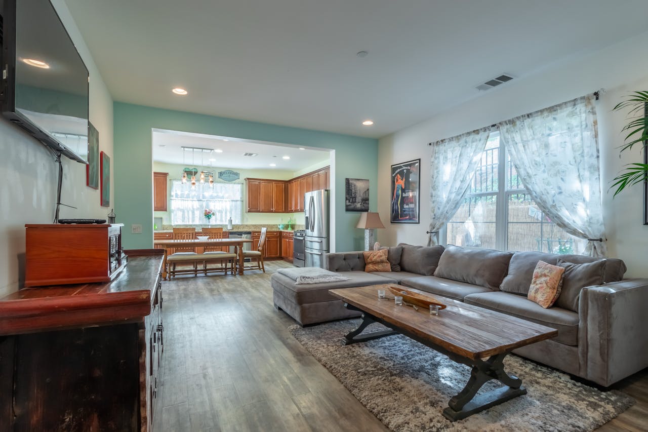
When every chair, sofa, console, and credenza sits on skinny, splayed legs, the room starts to feel twitchy and repetitive, as if it arrived in one boxed set. The fix is contrast: choose one anchor piece with a solid plinth, sled base, or skirted profile, then let tapered legs show up in smaller doses so they read like a signature detail. Extra grounding comes from scale and texture, such as a thicker rug, a heavier lamp base, or a table in stone or ceramic, which restores visual weight without losing that lifted midcentury ease. Varying leg height, especially on seating, keeps sightlines clean and the mix believable.
Matchy-Matchy Wood Tones Everywhere
A room can turn flat when walnut shows up on every surface, from floors to frames to furniture, leaving no place for the eye to rest. The fix is a controlled mix: keep one dominant wood tone for about 60%, add a lighter counterpoint like oak or ash, and introduce a third material such as painted metal, stone, or upholstered panels; a cool, textured rug helps break the brown-on-brown effect. Finish matters, too; swapping one glossy piece for a matte oil finish, or adding blackened steel hardware, sharpens the palette and makes the warm grain feel layered, intentional, and lived-in over time as daylight shifts across it.
Starburst Everything, Everywhere
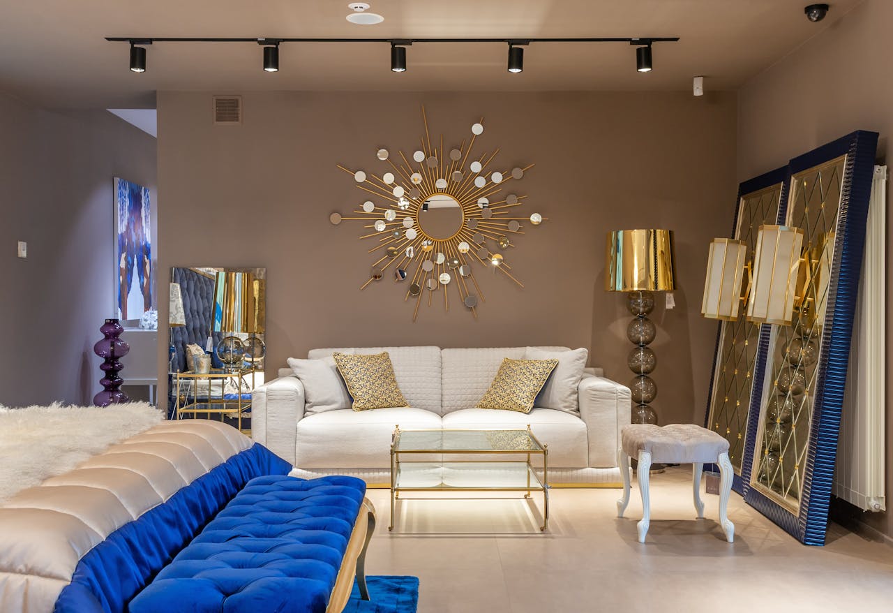
Starbursts are fun until they multiply: a clock, mirror, wall art, and cabinet pulls all shouting the same pointy rhythm, which makes the room feel busy even on a tidy day and adds a kind of visual static. A cleaner approach is to choose one starburst as the headline, place it where it earns attention, and then echo the energy with subtler geometry like a brass line drawing, a tapered cone lamp, or a faceted glass shade. Balancing it with organic shapes, plain textiles, and one calm wall color lets that single iconic burst read like history with a pulse, not a repeated motif seen in every corner in one glance.
Too Many Icon Replicas in One Room
A space starts to feel like a catalog when it stacks iconic shapes back-to-back, especially replicas that repeat the same curves, molded shells, and matching veneers. A smarter fix is to keep one true showpiece as the hero, then support it with quieter, less famous forms: a simple sofa, a solid-color rug, and one utility piece with straight lines; a single out-of-era vintage find breaks the symmetry. Materials do the heavy lifting, so swapping one faux-walnut surface for linen, leather, or stone and adding a handmade element, like a ceramic lamp, brings back depth, provenance, and a sense of life instead of display.
The Orange and Teal Trap
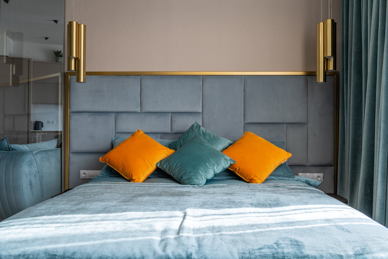
Midcentury color can turn harsh when every accent leans orange, teal, and mustard, creating a permanent poster vibe that reads louder than the furniture. The fix is restraint: keep one saturated hue as the lead, shift the rest into earthier neighbors like clay, olive, and smoke, and let neutrals carry the background through whites, taupes, and natural textures; swapping glossy accessories for matte ceramics softens the hit. Placement matters, so concentrating color in one zone, then adding a single unexpected note like burgundy or ink blue, makes the palette feel edited, current, and still true to the era overall.
Too Many Atomic Prints at Once
Atomic bursts, boomerangs, and scallops feel playful, but when they cover curtains, pillows, wallpaper, and dishes, the room turns into visual chatter and the furniture loses its authority. A cleaner fix is to use pattern once at a big scale, like a wallpapered niche, a single upholstered chair, or one large rug, then keep surrounding textiles quiet with solids, subtle weaves, and one simple stripe that echoes the era without copying it. If pattern has already spread, moving two items to another room and replacing them with texture, like boucle, linen, or cane, keeps the midcentury mood while restoring breathing room.
Sputnik Lights in Every Room
Sputnik chandeliers look dramatic, but repeating that spiky silhouette from entry to dining to bedroom can make a home feel themed rather than tailored, especially when bulbs stay exposed and glare bounces off hard surfaces. The fix is a lighting cast: keep one sculptural ceiling fixture as the star, then shift other rooms to simpler forms like globe pendants, paper lanterns, or a slim flush mount that fits the ceiling; adding dimmers changes everything. Layering with floor lamps and shaded table lamps, plus warmer 2700K bulbs, softens the mood so midcentury reads inviting and human, not like a set waiting for photos.
Open Shelves Packed With Knickknacks

Midcentury styling often collapses into clutter when open shelves fill up with tiny ceramics, souvenir glassware, and stacks of books in every gap, leaving the eye no place to pause. The fix is negative space: limit shelves to a few strong shapes, group objects in threes, vary heights, and repeat one material, like brass or matte black, so the composition feels deliberate; closed baskets, boxes, or cabinet doors can hide the everyday pieces. If the shelf still looks noisy, swap five small items for one larger artwork or a single sculptural vessel, and the room instantly regains that clean, confident midcentury calm.
Furniture That Is Too Low for Real Living
Low-slung sofas and lounge chairs look sleek, but when every seat sits close to the floor, the room can feel awkward, harder to get up from, and less comfortable for long conversations. The fix is to raise the experience without losing the look: keep one low statement chair, then add a higher-backed option, choose a sofa with a slightly taller seat height, and use a thicker rug pad to soften the landing and improve acoustics. Function can stay handsome, too, by pairing low pieces with a taller side table, a reading lamp at the right height, and pillows in supportive fills, so the style serves daily life with ease.
Too Many Sharp Angles, Not Enough Softness
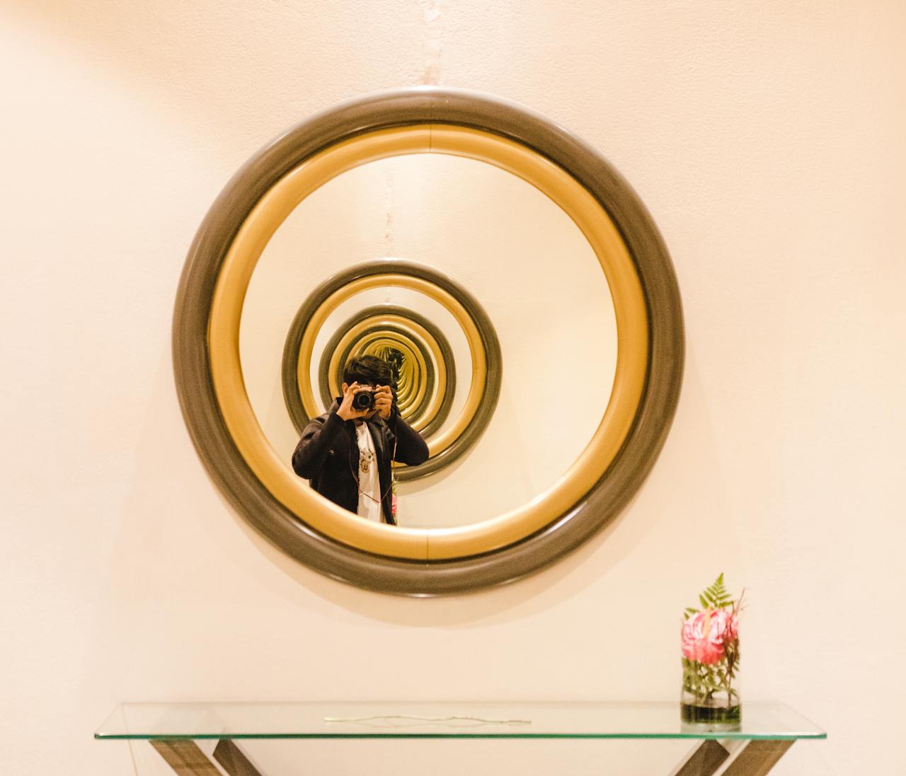
Midcentury loves geometry, but when every edge is a triangle, chevron, or knife-thin rectangle, the room can start to feel tense, like it is always posing instead of resting. The fix is to introduce a few rounded forms that still belong: a drum shade, an oval mirror, a tulip-style table base, or even a gently curved sofa arm that interrupts the hard lines without changing the vocabulary of the space. Texture finishes the job, so adding boucle, wool, linen, or leather with a little patina absorbs the sharpness, improves comfort, and lets the clean silhouettes feel warmer with curtains or greenery as a final soft edge.