For years, car interiors chased one idea: fewer physical controls, bigger screens, cleaner dashboards. It looked modern, and it helped brands push software-first identities. But daily driving is not a product demo. It is a high-attention task where small delays in control access matter.
As more drivers spent time with fully screen-led cabins, one pattern kept repeating. Simple actions could require too many taps, too much visual search, and too much mental effort. The issue was not technology itself. The issue was interface friction during motion.
Safety researchers, testing programs, and regulators started focusing on that friction. They looked less at screen size and more at cognitive workload, glance time, and control availability for essential functions. That changed the conversation from style to human limits. It also changed how automakers are now being evaluated.
The result is a design correction, not a rejection of digital cabins. Screens remain central, but tactile inputs are returning where speed and certainty matter most. Steering wheel buttons sit at the center of this shift because they reduce reach, search, and delay. The new direction is simple: keep intelligence, cut distraction.
Screen-First Design Reached a Human-Limits Wall
All-screen interiors solved real engineering and production problems. They reduced part counts, simplified updates, and gave teams flexibility to change features through software. From a product planning perspective, that was a clear win. From a driving perspective, it introduced a hidden cost.
When a driver must scan menus to change a basic function, attention gets split at the wrong moment. Even short glances become risky when repeated inside dense traffic, bad weather, or unfamiliar roads. The danger rarely comes from one tap. It comes from a chain of taps and visual confirmations.
This is where human factors entered the spotlight. Researchers kept showing that driver attention is finite and easily overloaded by layered interfaces. The cabin looked cleaner, but interaction paths got longer. That gap between visual simplicity and operational complexity became hard to ignore.
Once safety bodies began scoring interface behavior more directly, screen-first design lost its automatic advantage. A minimal dashboard no longer guaranteed a better safety perception. Automakers had to prove that critical controls were quick, stable, and usable under stress. That pressure is driving the current return of tactile controls.
Research Showed Workload Stayed High During Common Tasks
Large on-road studies of infotainment systems found that routine tasks often imposed high demand. Navigation entry, media browsing, call handling, and certain voice workflows could keep drivers mentally occupied for too long. These were not edge cases. They were everyday interactions in normal trips.
The strongest finding was consistency across systems with different visual styles. Some looked intuitive at first glance but still required extended attention once moving. Others reduced visual clutter yet forced deeper menu travel. The interface felt modern, but the workload stayed high.
Safety guidance in the U.S. has long emphasized short glances and limited task duration for in-motion interactions. That principle keeps resurfacing because it reflects real driver limits, not theory. If a control flow repeatedly exceeds those limits, the system is asking for trouble. High demand is a design issue before it becomes a crash statistic.
This is why the industry started separating feature richness from usable safety. A car can offer many capabilities and still fail basic attention discipline. Researchers did not argue against innovation. They argued for interaction paths that respect cognitive load while the vehicle is moving.
Safety Protocols Changed the Design Incentives
Rating programs began updating how they assess modern cockpit safety, and that changed manufacturer behavior quickly. Newer protocols in Europe now place greater emphasis on driver engagement and distraction-resilient control design. In plain language, they reward cabins that keep essential actions easy to execute. That includes physical buttons or fixed, always-available control zones.
This shift matters because it turns interface quality into a competitive metric. Carmakers care about safety ratings for credibility, marketing, and market position. Once interface design affects scoring, it moves from optional philosophy to core engineering priority. Teams get budget, deadlines, and accountability.
The policy signal also aligns with consumer complaints. Drivers had already been saying that some screen-heavy cabins felt awkward during real driving. Now the rating frameworks reflect that lived experience. Designers can no longer assume that sleek visuals will outweigh operational friction.
The practical outcome is visible across new model cycles. Brands are not removing screens, but they are restoring direct access for high-frequency and high-urgency functions. That is the key correction. Safety is being treated as interaction design, not only crash structure and airbags.
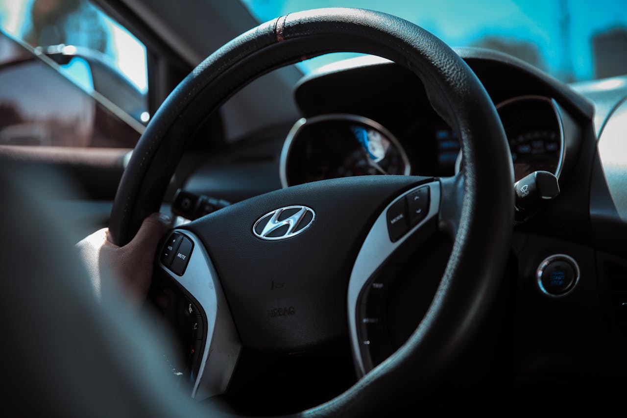
Steering Wheel Buttons Returned Because They Cut Search Time
Steering wheel controls solve a basic mechanical problem in driving ergonomics. They keep important actions close to where hands already rest and eyes already orient forward. That reduces physical reach and shrinks visual detours. In fast traffic, those seconds matter.
Buttons on the wheel also create tactile consistency. A driver can build muscle memory for recurring actions like audio adjustment, call handling, or driver-assist toggles. Muscle memory is not a luxury feature. It is a safety feature because it reduces decision time and visual dependency.
When controls move around menus, the driver must re-locate them each time. That repeats the same cognitive burden on every trip. Steering wheel buttons reduce that burden by keeping command points stable and immediate. Stability is the hidden value that touch-only systems often lost.
The return of these buttons is not nostalgia for older cabins. It is a response to measurable distraction patterns and real driver behavior. Better access points produce better attention management. That is the entire point.
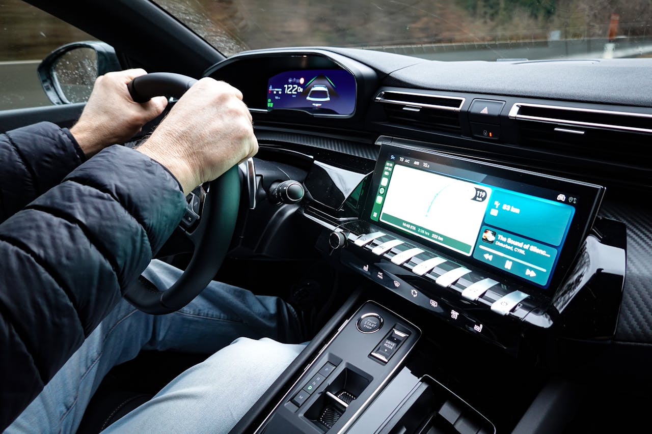
Hybrid Cabins Replaced All-Screen Minimalism
Most manufacturers are not abandoning large displays. They are adopting hybrid layouts where screens handle depth and tactile controls handle urgency and frequency. This division of labor works better in motion. It respects both technology goals and human limits.
In these cabins, maps, media ecosystems, and advanced settings stay digital. But crucial actions become easier to reach without menu diving. Hazard functions, key climate controls, and essential drive-related inputs are increasingly treated as immediate-access features again. That reduces friction where it matters.
Several major brands have publicly acknowledged customer pushback on purely touch-led interaction. Their newer cabins reflect a course correction toward clearer button maps and better tactile logic, especially on the steering wheel and around core controls. This is market feedback turning into design language. It is not a temporary styling trend.
The hybrid model is likely to dominate the next few years because it gives automakers flexibility without sacrificing usability. They can keep software-driven innovation while reducing distraction exposure. That balance is harder to market in one headline, but it works better on real roads.
Better Controls Still Need Better Execution
Adding buttons does not automatically create a safer interface. Bad labeling, crowded layouts, or inconsistent behavior can still confuse drivers. If controls are present but unclear, cognitive load remains high. Good hardware needs good interaction logic.
Execution also matters across trims and regions. A model line may have excellent controls in one version and compromised controls in another. Buyers often assume interface quality is uniform, but it rarely is. Details can change with packages, software versions, and market-specific configurations.
Design teams must also avoid replacing one problem with another. Too many small buttons can overwhelm just as much as deep menus if hierarchy is unclear. The goal is not maximum hardware. The goal is fast, obvious access to high-priority functions.
The best cabins use simple prioritization. Critical tasks are immediate, frequent tasks are close, and non-urgent tasks can live deeper in the screen. That structure keeps mental demand predictable. Predictability is what improves driver behavior under pressure.
What Buyers Should Test Before Choosing a Vehicle

Shoppers should evaluate cabins in motion-oriented terms, not showroom aesthetics. Ask how many steps it takes to adjust common settings while driving. Check whether core functions can be changed without hunting through multiple screens. If the path feels long when parked, it will feel worse in traffic.
Test steering wheel controls for tactile clarity and consistency. Buttons should be easy to distinguish by feel and should map logically to expected outcomes. If every press requires a visual confirmation, the design is not doing enough. Good controls should reduce eyes-off-road moments.
Pay attention to emergency and high-use functions. Hazard activation, defogging, temperature adjustment, and audio interruption should be easy and immediate. These are practical stress moments, not optional conveniences. A strong cabin handles them cleanly with minimal cognitive effort.
Finally, do not rely only on marketing claims about smarter interfaces. Look at independent safety testing frameworks and real-world reviews focused on distraction and usability. A vehicle can be digitally advanced and still be operationally clumsy. Buyers should reward the cabins that respect attention first.
This Shift Is About Cognitive Safety, Not Nostalgia
The return of steering wheel buttons is part of a broader reset in how road safety is defined. For years, conversation centered on structural crash protection and sensor technology. Those remain essential, but they do not replace interface discipline. A safe car must also protect driver attention.
Cognitive safety means designing systems that demand less from the brain during active driving. It means shorter interaction chains, clearer hierarchy, and stable control locations. These choices sound small, but they shape reaction windows and error rates. Tiny friction points add up fast behind the wheel.
Researchers, safety programs, and consumers now agree on the direction, even if implementation varies by brand. The industry is moving toward cabins that blend software power with tactile certainty. That is a healthier model for real-world use. It preserves innovation while reducing avoidable distraction.
What this really means is straightforward. The best cockpit is not the one with the fewest buttons. It is the one that lets a driver stay focused on the road while still controlling the car quickly and confidently.