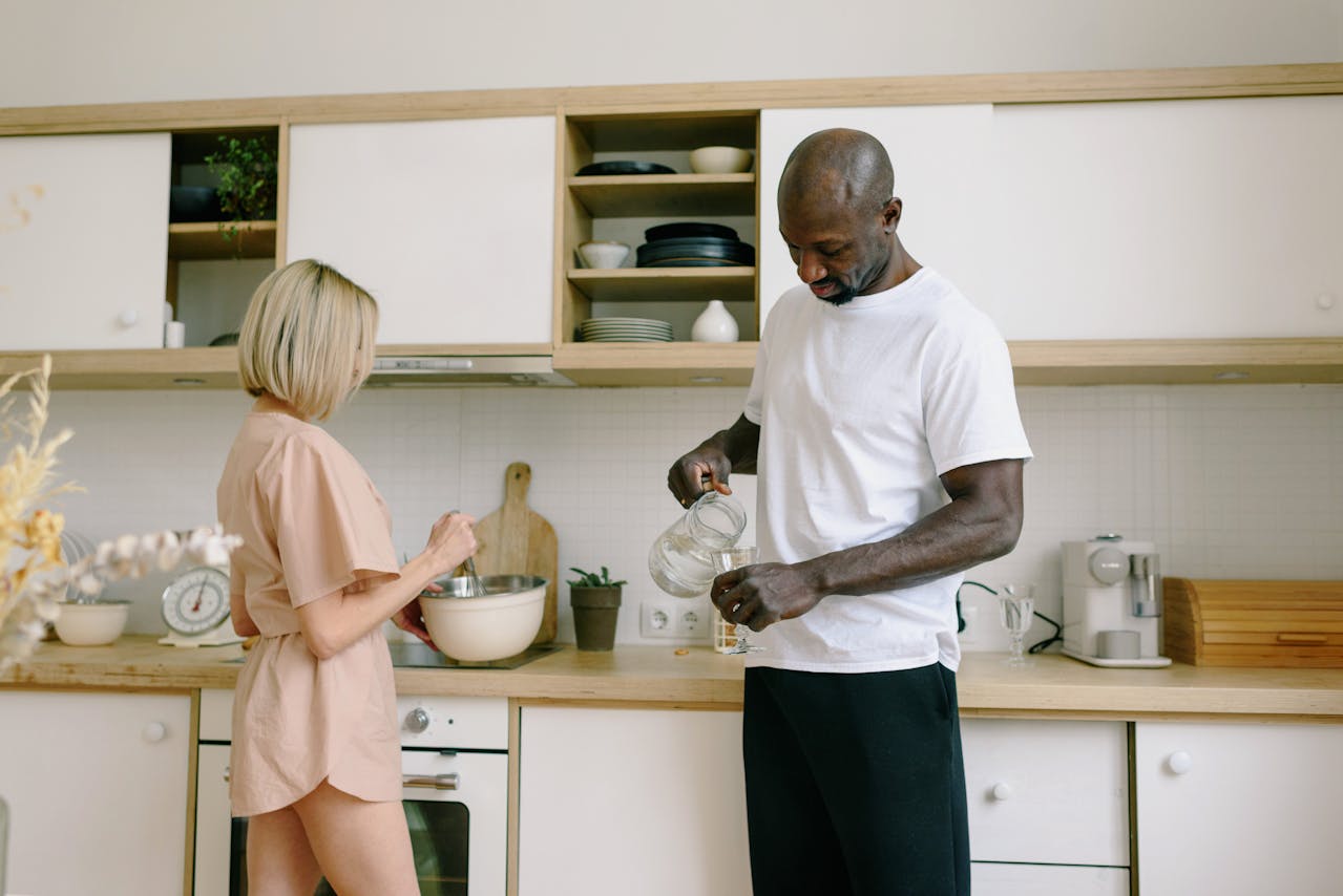
For a decade, the all-white kitchen signaled fresh, safe, and resale-ready. Now the mood is shifting. Homeowners are chasing warmth, texture, and rooms that feel lived-in rather than showroom-clean. White still appears, but it is getting tempered by oak, stone with real movement, softer paint tones, and hardware that reads like jewelry. The change is less a rejection of light than a craving for depth, comfort, and a little personality where life actually happens even on messy weeknights. Instead of a single note, kitchens are being built like a chord: pale, warm, dark, and textured at once, with room for mistakes.
Warm Woods Start Replacing White Cabinets
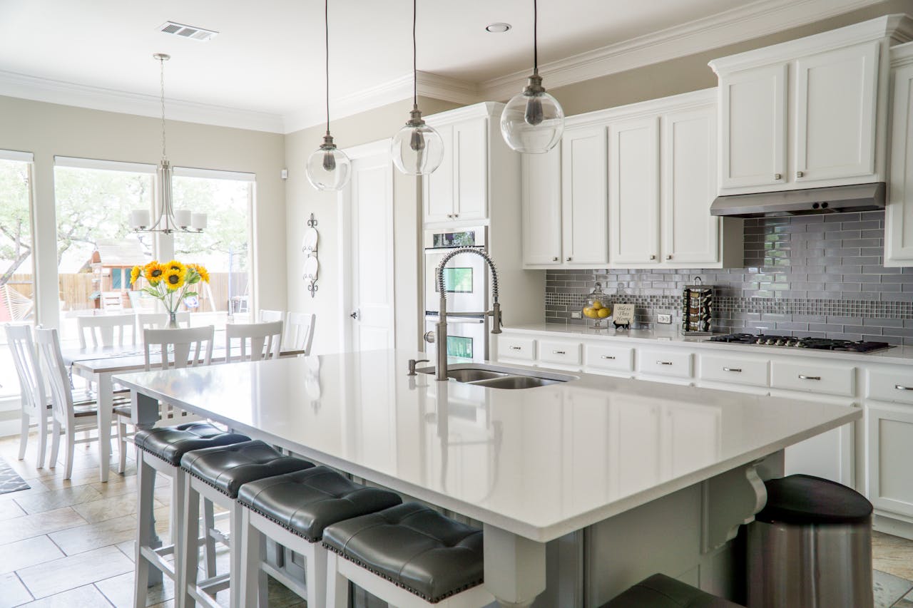
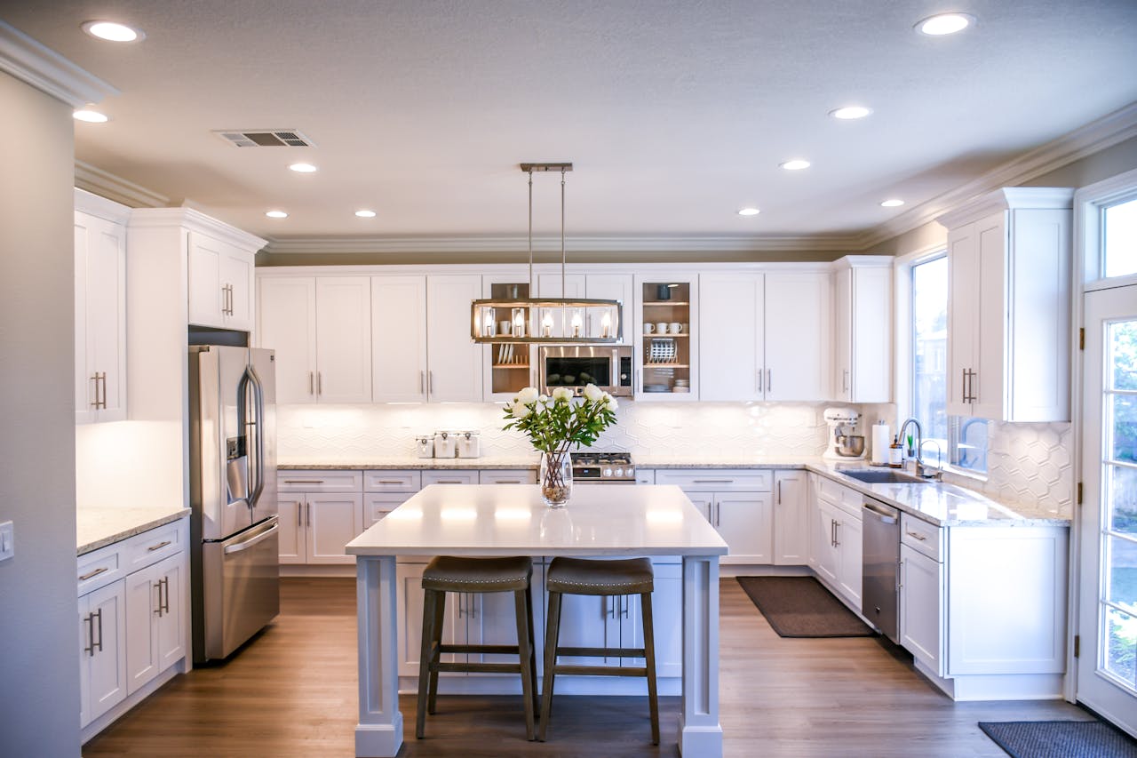
White-on-white reads crisp in photos, but many remodels are leaning into wood that carries a heartbeat. Rift-sawn oak, white oak, and walnut stains soften hard lines, add natural variation, and make even simple cabinet boxes feel more bespoke, especially when paired with honed stone and warm metals. When grain shows up on lowers, an island, or a pantry wall, the kitchen stops looking like a showroom and starts feeling grounded, the kind of place where coffee spills, chairs scrape, and the surfaces are allowed to age without being judged. That shift is a quiet vote against pure white as the main character anymore.
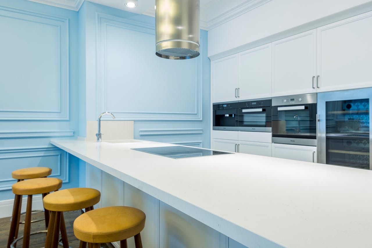
Two-Tone Layouts Become the New Default
Instead of painting every surface the same bright shade, designers are splitting the palette on purpose, and homeowners are embracing it because it feels practical. Light uppers keep the room open, while deeper lowers or a wood island anchor the sightline, hide toe-kick scuffs, and make countertops and backsplashes read like deliberate layers. This approach lets white stay in the mix without taking over, and it makes a kitchen feel designed for real routines: kids grabbing snacks, pots drying on towels, and a space that looks pulled together even when the sink is not. It keeps shadow and warmth, not sterile glare.
White Paint Shifts Toward Cream and Putty
Pure, icy whites can turn gray or blue under LEDs, and that cool cast is starting to feel dated in homes that want softness at night as well as daylight. Softer whites with cream, beige, or mushroom undertones keep the brightness but lose the sterile edge, and they stay steadier as light changes from morning sun to 9 p.m. task lighting. Once walls, cabinets, and trim drift toward warmer whites, the old all-white formula looks too sharp, because it fights brass, wood, and stone, and it reads less like calm and more like glare. That is when off-white becomes the neutral, and pure white becomes an accent used sparingly.
Backsplashes Get Taller, Louder, and More Textured
All-white kitchens often leaned on a thin subway-tile band and a lot of blank wall, which kept things safe but also left the room visually quiet in a forgettable way. Now backsplashes climb higher, sometimes to the hood or ceiling, and they bring texture through handmade tile, zellige-style variation, fluted stone, or slab marble that runs behind open shelves. Once the wall has pattern, sheen, and shadow, cabinets no longer have to vanish into the same shade, and an all-white scheme can feel underdressed, like it forgot the room’s punctuation and story. The eye wants somewhere to land: wood, softer paint, warm metal.
Countertops Show Veining Instead of Disappearing
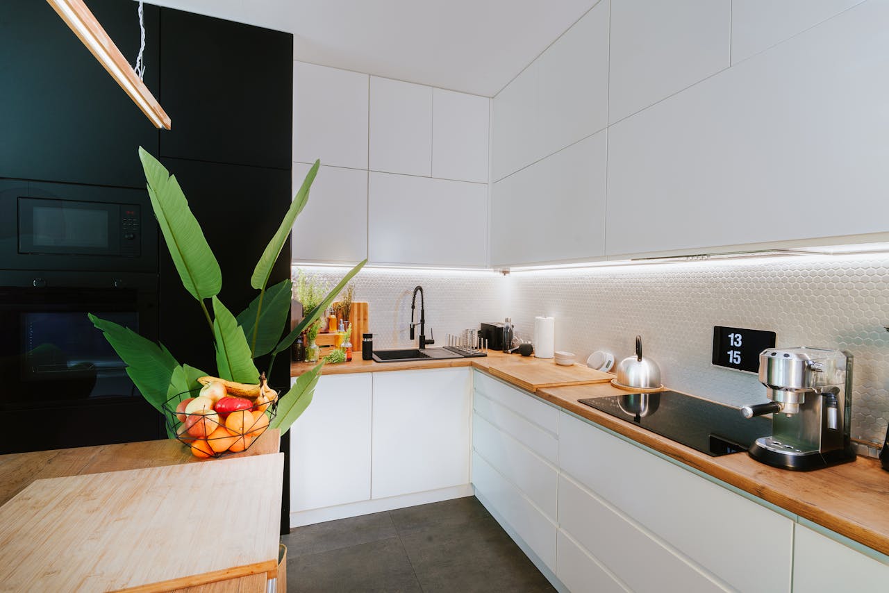
A spotless white counter can look clean, but beside white cabinets it can also feel like the kitchen is missing contrast, especially in open plans where the eye needs a break. More homes are choosing surfaces with visible movement, warmer marbles, dramatic quartz patterns, soapstone looks, or honed finishes that read softer in daylight and hide micro marks from daily prep. Once the counter has character, an all-white cabinet run starts to look like a blank frame around a bold painting, and the instinct is to bring in wood, color, or even just an off-white to keep the composition from flattening out in photos, too.
Hardware Turns Into Jewelry, Not an Afterthought
Tiny chrome knobs disappear on white doors, and that invisibility is part of why many all-white kitchens feel anonymous, like they were assembled from a template. Bigger pulls, bin-style handles, and warmer finishes like aged brass, bronze, or blackened steel add a focal point at hand level, and they bring a tactile cue that says the room was chosen, not defaulted. When hardware is meant to be seen and felt, it pushes against the idea that everything should blend into one shade, and it often exposes the weakness of pure white fronts: they can look like the background, not the feature. That is the tell in daylight.
Matte and Satin Finishes Beat High-Gloss White
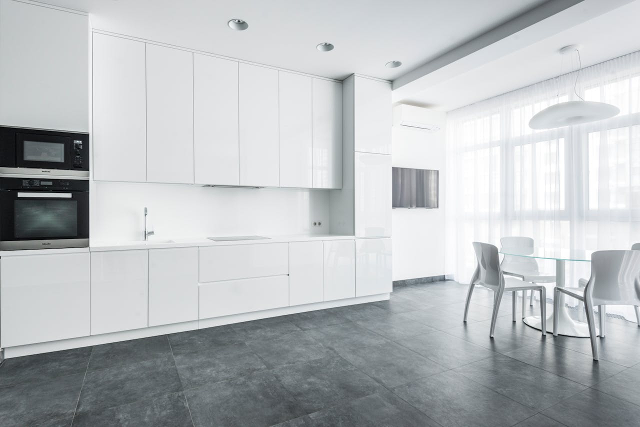
High-gloss white cabinets reflect every light source, fingerprint, and micro-scratch, which can make a kitchen feel sharp and restless, even when the layout is calm. Matte and satin finishes absorb light in a softer way, they photograph with gentle shadow, and they pair naturally with wood, stone, and warmer metals without turning the room into a mirror. As sheen drops, the space looks more considered and less like a quick flip, and the classic shiny all-white look starts to read like an old promise of modernity, not the comfort people want now. It also hides the small scuffs that show up near handles and corners.
Open Shelving Returns With Color and Patina
A fully white kitchen often depends on hidden storage to keep the look spotless, so anything left out feels like a mistake rather than a normal part of cooking. But more homes are carving out open shelves that show ceramics, cookbooks, spice jars, olive oil bottles, and the pieces that make a kitchen feel personal instead of staged. Once color and patina are part of the picture, the room wants a warmer backdrop and gentler contrast, and endless white starts to feel too precious for the everyday story it is trying to tell. It is a shift from hiding life to designing around it, which all-white rarely does gracefully.
Appliances and Fixtures Go Darker or More Integrated
Stainless steel used to be the default contrast in white kitchens, but it can look busy when every surface is bright and reflective, especially with multiple appliances in one sightline. Panel-ready fridges, integrated dishwashers, built-in ovens, and quieter hoods calm the visual noise, and darker fixtures like black or bronze faucets add definition without looking flashy. As appliances disappear behind cabinet fronts or deepen in tone, a pure white envelope can feel too stark, because the room loses midtones and shadows, the subtle gradients that make a space feel real. That is when white starts getting edited down.
Lighting Warms Up and Reveals Harsh Whites
Cool under-cabinet strips and bright recessed grids can make white surfaces glare, turning a kitchen into the kind of space people avoid at night because it feels overlit. Warmer, layered lighting, including pendants over an island, a dimmable ceiling plan, and softer LEDs under cabinets, flatters food, skin, and finishes, and it makes the room feel welcoming instead of clinical. Once lighting is tuned for comfort rather than maximum brightness, pure white cabinets can look sharper than intended, and the eye starts asking for warmth, so wood tones and creamy paints quietly step in. Even the shadows matter after sunset.
Maintenance Fatigue Starts Driving Color Choices
All-white kitchens ask for constant policing: grout lines, toe-kicks, range splatter, and scuffs show up fast, and the room can start to feel like it is always under inspection. In busy households, that turns a dream renovation into a daily chore, because every simmer, every bag brushed against a cabinet corner, and every kid-height fingerprint becomes part of the design. A little color, visible grain, or a slightly deeper white hides life better, and it signals a kinder idea of beauty, one that can handle sauce, coffee rings, and time without looking like it failed. People are choosing peace over perfection here.