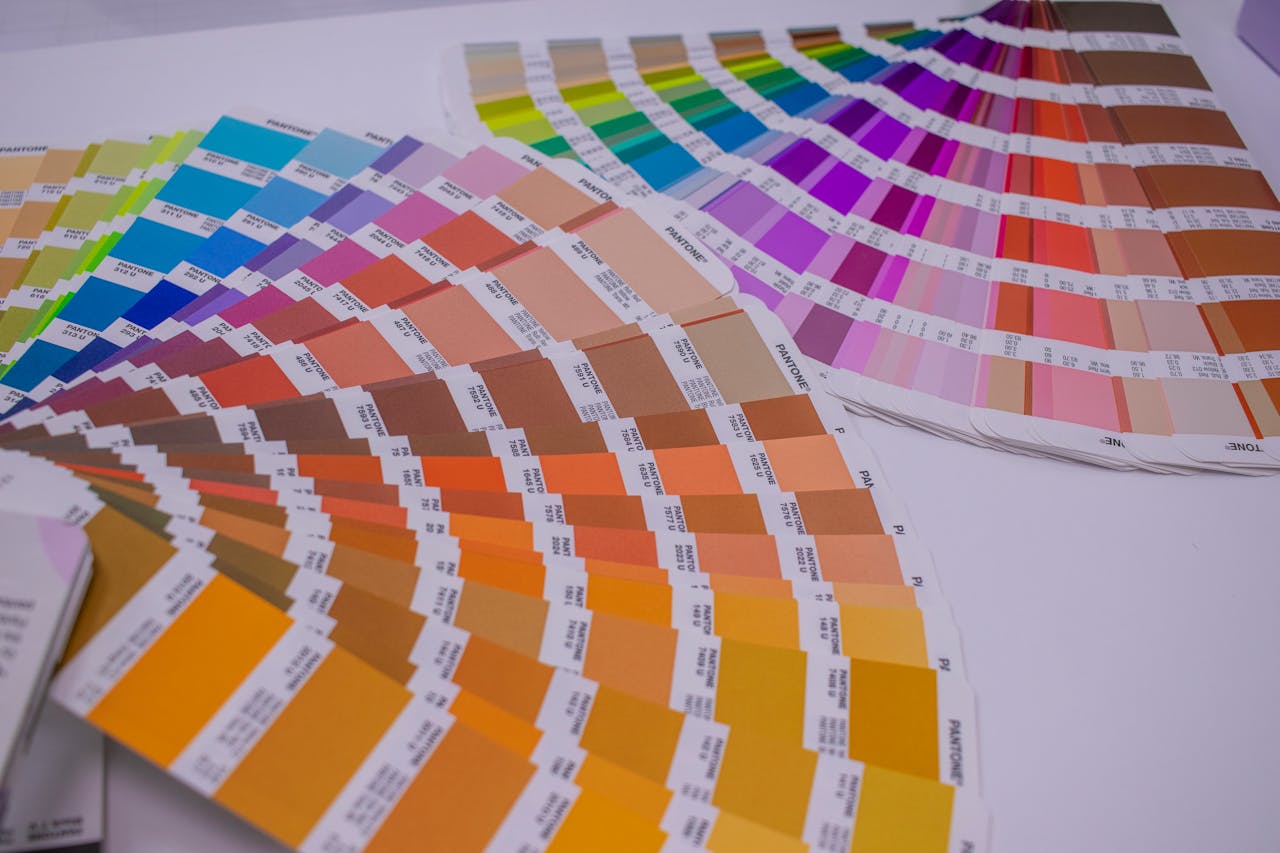
Most people can recite a zodiac sign or favorite playlist, but the color that greeted their birth year often goes unnoticed. Pantone Color of the Year began as a trend signal and slowly turned into a cultural diary, distilling each year into one concentrated hue. These choices echo what people crave in their homes, closets, and screens, from calm blues to defiant magentas. Looked at together, they sketch a quiet emotional timeline, tracing how hope, anxiety, and comfort have shifted across recent decades.
2026: Cloud Dancer

Cloud Dancer marks 2026 with a quiet white that feels less like absence and more like a pause to breathe and reset. It reflects a moment when people are editing their lives, stripping away clutter, and chasing focus instead of constant stimulation and noise from every screen. Paired with soft blue, peach, and yellow, it suits sunlit corners, crisp bedding, gallery walls, notebooks, and sketchbooks left open on the table. A birth year tied to Cloud Dancer carries the promise of clarity, intentional living, and a calmer rhythm that leaves room for listening. It feels like a year framed by blank pages waiting for careful ink.
2025: Mocha Mousse
Mocha Mousse wraps 2025 in a mellow brown that recalls coffee foam, worn leather chairs, and quiet afternoons that stretch past sunset. It was framed as a comforting answer to restless news cycles, a shade that invites slower conversations, deeper breaths, and simple grounding rituals. On walls and fabrics, it feels like a familiar café where staff remember every regular and the soundtrack stays low enough for reflection. A birth year linked to Mocha Mousse suggests warm hospitality, emotional steadiness, and a quiet loyalty to people and places. It suits a generation drawn to cozy rooms, slow mornings, and stories told face to face.
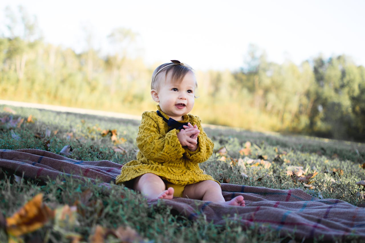
2024: Peach Fuzz

Peach Fuzz colors 2024 with a soft glow that falls somewhere between fruit skin and late afternoon light on a calm wall. It was chosen as a reminder that tenderness still matters, even as screens crowd every corner of daily life and headlines rarely pause to breathe. Designers favored it for bedrooms, living rooms, and studios where faces and feelings needed to look rested rather than drained. A birth year marked by Peach Fuzz carries whispers of closeness, chosen family, and faith in gentle gestures as quiet acts of courage. It suits shared sofas, long talks, and warmth that lingers long after guests leave.
2023: Viva Magenta

Viva Magenta charges 2023 with a fearless mix of red and pink that feels like lipstick, protest posters, club lights, and glitch art combined. It arrived as a response to years of muted palettes, calling for louder self expression, reclaimed joy, and playful drama in both wardrobes and feeds. On clothes, walls, and screens, it reads like a pulse, refusing to fade politely into the background or ask for permission. A birth year under Viva Magenta signals a generation raised to experiment and treat color as a serious, everyday source of courage. It hints at futures lit by bold collaborations, honest art, and friendships that respect intensity.
2022: Very Peri

Very Peri sets 2022 in a soft blue violet that looks like twilight on a laptop screen at the edge of work and play. It captured a world in between, where offices moved to kitchens, games became hangouts, and creativity spilled across physical and digital spaces. The shade feels curious rather than calm, like a question mark drawn in color and left hovering over familiar routines. A birth year marked by Very Peri carries an expectation of flexible thinking, hybrid identities, and comfort with constant reinvention and quiet risk. It fits lives that slide between screens and tables, treating experimentation as a normal, daily habit.
2021: Ultimate Gray And Illuminating

Ultimate Gray and Illuminating defined 2021 as a year of uneasy balance between heaviness and hope after long months of strain. A solid gray spoke to fatigue, infrastructure, and stone foundations, while bright yellow cut through with images of kitchen windows, sticky notes, and small celebrations. Together they acknowledged that resilience and optimism had to share the same room and hold each other up. A birth year linked to this pairing suggests a generation that understands grief and brightness as neighbors and learns to carry both with honesty. It reflects a time when realism and hope stayed stubbornly side by side.
2020: Classic Blue

Classic Blue set 2020 in a deep, steady hue that feels like the sky just before sunrise, when the world holds its breath. Pantone presented it as dependable, a color to lean on when everything else started to flicker and fray around daily routines. It slid easily into uniforms, branding, and bedroom walls that needed to feel safe, familiar, and quietly protective. A birth year framed by Classic Blue carries associations with resilience, bedtime rituals, trusted voices, and faith that long nights will eventually break into light. It suits memories of favorite blankets, steady playlists, and the calm of a horizon that refuses to rush.
2019: Living Coral

Living Coral splashed 2019 with a bright yet softened orange pink that feels like reef shallows, vintage lipstick, and party glassware. Pantone described it as life affirming, tying its cheerful tone to social connection and time spent offline in real company. It paired beautifully with olive green, mauve, and soft purple, creating palettes that felt both modern and nostalgic. A birth year linked to Living Coral carries an undercurrent of optimism stitched to environmental awareness and a love of gatherings that actually feel alive. It reflects a time when cheerful color carried party energy and a plea to take threatened oceans seriously.
2018: Ultra Violet
Ultra Violet cast 2018 in a blue based purple linked to outer space, stage lights, and late night ideas scribbled in notebooks. Pantone leaned into its sense of mystery and experimentation, framing it as a color for pushing beyond obvious paths. Paired with soft greens, melon shades, and warm copper, it shifted from cosmic to grounded with a few simple moves. A birth year marked by Ultra Violet suggests imaginative minds, a pull toward music and art, and comfort exploring questions that do not have neat endings. It belongs to a cultural moment that treated curiosity as a superpower and welcomed people who preferred stargazing over small talk.
2017: Greenery
Greenery burst into 2017 as a zesty yellow green, like new leaves after rain or herbs chopped over soup at the last second. It symbolized a desire to reset and breathe, answering crowded cities and endless notifications with images of parks, hikes, and windowsills lined with plants. The shade was softer than later forest greens but still vivid enough to wake up a room. A birth year tied to Greenery hints at lives shaped by wellness talk, sustainability efforts, and small daily choices aimed toward renewal. It carries the memory of reusable bags, farmers markets, and office desks with stubborn succulents that refused to give up on light.