
By the time mid-century grocery design met social media nostalgia, the 1960s food aisle turned into a visual mood board. Chrome fonts, bright cartons, and playful promises still photograph beautifully, so vintage finds keep resurfacing in thrift hauls and retro kitchen posts. But daily experience was often stranger than the packaging implied: sweeter than expected, saltier than memory, softer in texture, and built for convenience over depth. What looked futuristic in a tidy ad could feel oddly flat at the dinner table, where novelty and comfort did not always land in the same bite. That tension still defines their charm.
Swanson TV Dinners
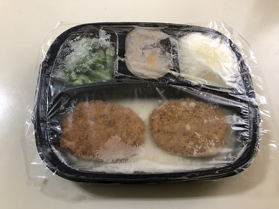
Online, the foil tray still reads like retro genius: neat compartments, bold branding, and a promise that dinner could run on schedule. Through the 1960s, TV dinners became a symbol of modern convenience, especially in homes balancing work, school, and tightly timed evenings. The idea felt liberating, and the format looked surprisingly current for its era.
At the table, the glow faded a bit. Compartments heated unevenly, vegetables softened fast, and flavor often leaned practical rather than layered. People remembered the breakthrough more than the bite itself. Convenience won the moment, but the meal could feel engineered, not soulful.
Tang Powdered Drink Mix

Tang still wins the visual game. The bright jar, clean scoop ritual, and space-age color made it feel like science had moved into the pantry. In the 1960s, that mattered. Packaged optimism had power, and Tang looked like progress in powdered form, especially when family culture was leaning into speed and novelty.
Taste told a different story for many households. Sweetness arrived first, citrus felt blunt, and the finish landed closer to candy than fresh fruit. The brand became iconic anyway, mostly because it carried an emotional promise: the future, simplified, in one glass and one stir.
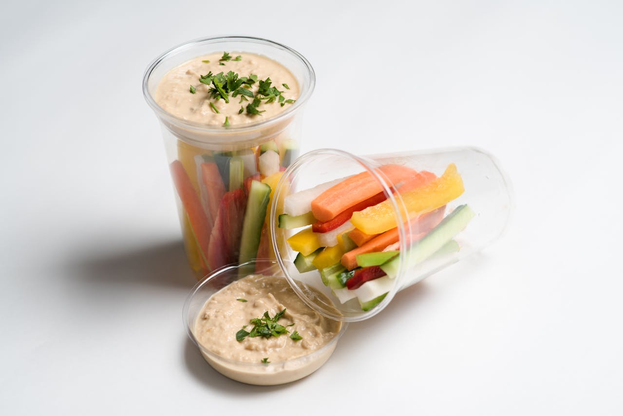
Jell-O Savory Salad Molds
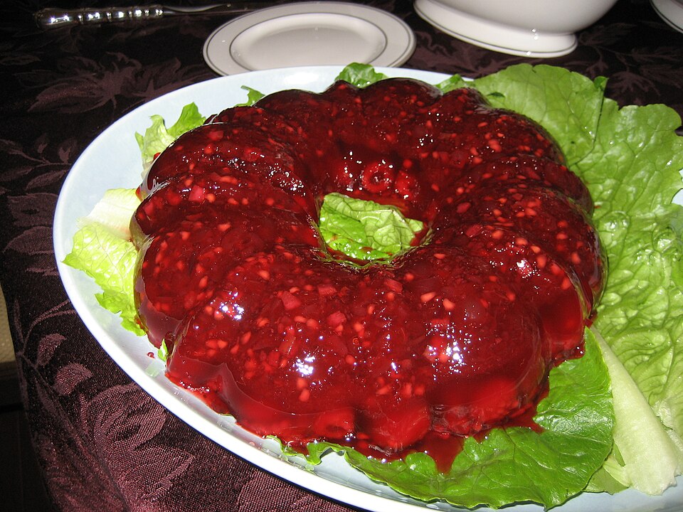
Gelatin molds still look incredible in photos. Their shine, height, and sculpted edges made everyday ingredients appear formal, planned, and party-ready. In 1960s entertaining culture, that presentation mattered as much as flavor. A molded dish signaled effort, coordination, and a host who knew how to stage a table.
In real life, texture divided people fast. A cool wobble wrapped around tuna, olives, or vegetables felt refined to some and unsettling to others. The idea was never boring, but it was easy to admire more than enjoy. Today, the fascination is cultural first and culinary second.
Pop-Tarts Before Frosting Took Over
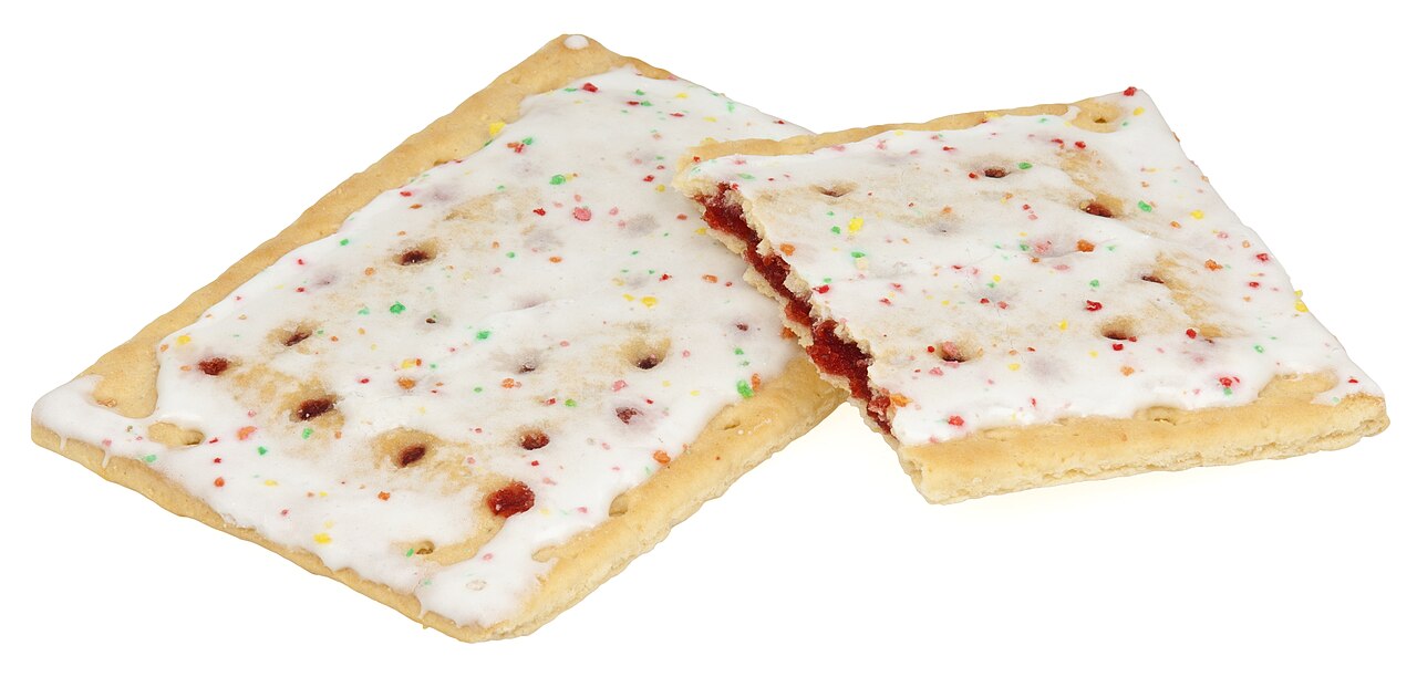
Early Pop-Tarts boxes still look sharp in vintage scans: minimal, confident, and unmistakably mid-century. When toaster pastries spread nationally in the 1960s, they captured a new breakfast logic where speed could outrank ritual. The product felt modern, efficient, and perfectly aligned with mornings built around movement.
On the plate, the experience could feel plain. The crust leaned dry, the filling felt thin, and the payoff depended heavily on timing and brand freshness. What survived was the invention itself, not always the flavor memory. The package promised excitement; the bite often stayed restrained.
SpaghettiOs and the Soft Texture Era
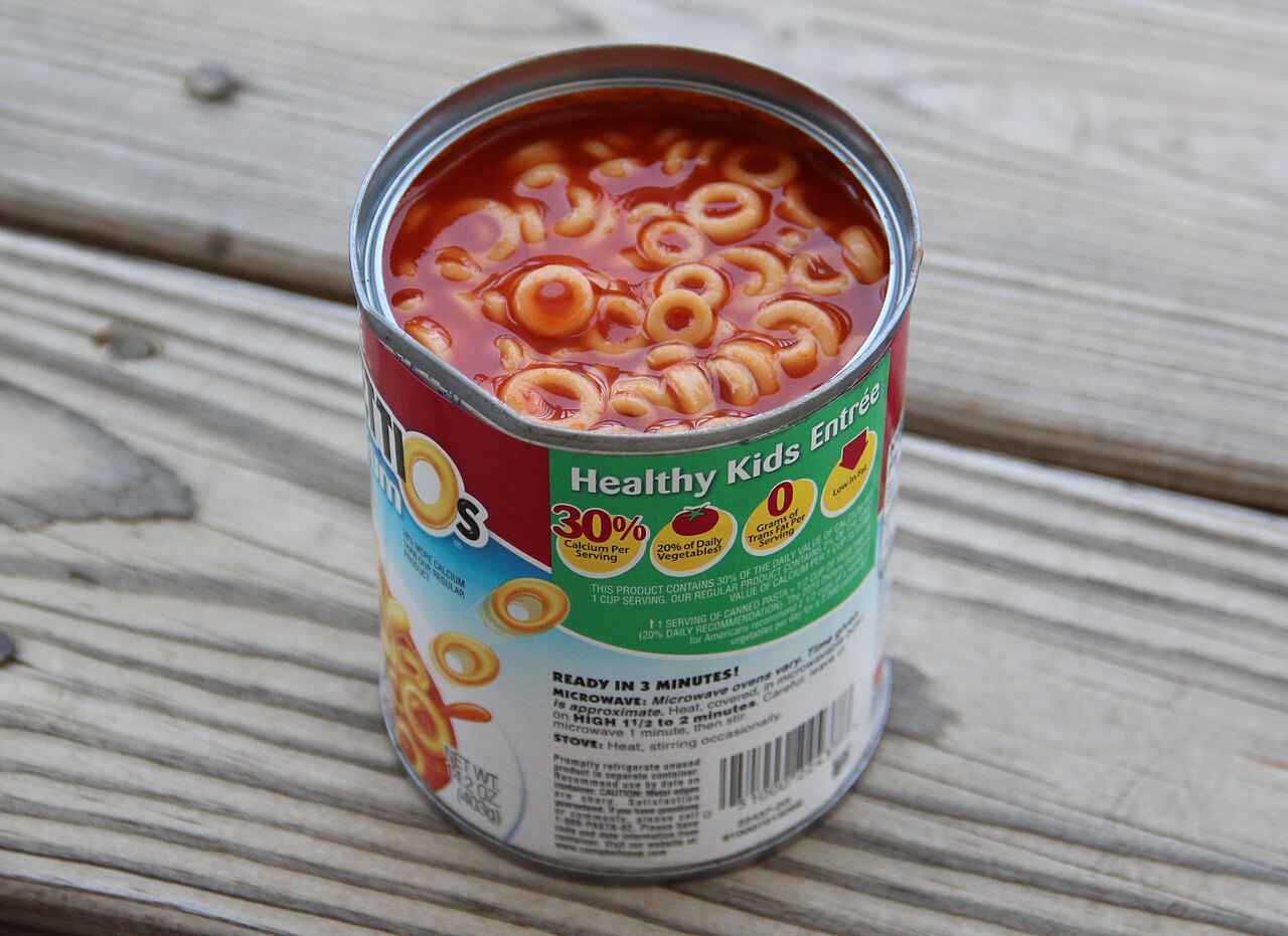
Few labels from that decade are as recognizable as SpaghettiOs. The can still reads warm and familiar, almost like a childhood signal in grocery form. During the 1960s convenience wave, it offered certainty: open, heat, serve, done. For families managing hectic evenings, that simplicity made it easy to trust.
Texture is where nostalgia gets tested. The rings were intentionally soft, the sauce leaned sweet, and every spoonful felt nearly identical. Predictability was the point, but modern palates can read that uniformity as one-note. Comfort stayed high, while culinary surprise stayed low.
Cool Whip as Instant Elegance

Cool Whip became a fast track to dessert polish. One spoonful could dress pie, fruit, pudding, or gelatin and make the entire plate look planned. In 1960s and late-mid-century kitchen culture, that visual reliability was powerful. It reduced labor, saved time, and delivered a consistent finish for gatherings.
The flavor tradeoff was clear. Sweetness and texture were stable, but complexity often lagged behind fresh whipped cream. Even so, it earned loyalty because it solved real pressure points. Presentation came quickly, cleanup stayed manageable, and desserts looked festive with minimal effort.
TaB and Early Diet Soda Cool

TaB looked like design-forward confidence in a can. Bright color, clean layout, and a clear identity gave it a strong shelf presence in the 1960s, when diet messaging and personal image were becoming part of everyday grocery decisions. It did more than sell a drink; it sold a lifestyle shift.
Taste response was mixed from the start. Early diet profiles had a distinctive edge that some fans embraced and many tolerated. Yet the product mattered beyond flavor. It marked a moment when supermarkets began marketing identity, restraint, and aspiration as aggressively as refreshment.
Instant Mashed Potatoes

Instant mashed potatoes promised comfort without peeling, boiling, or mashing. That promise resonated in homes where time mattered as much as tradition. The box represented dependable speed, long shelf life, and dinner insurance on rushed nights. For many families, it was less about replacing scratch cooking and more about surviving weekdays.
On the plate, texture could feel too uniform, and flavor sometimes missed the earthy depth of fresh potatoes. Still, the product endured because it solved labor and timing better than almost anything in its category. It was practical, predictable, and easy to scale for hungry tables.
Space Food Sticks at the Grocery Shelf
Space Food Sticks looked like edible futurism. Their foil-wrapped identity borrowed heavily from the era’s fascination with astronauts, innovation, and engineered nutrition. On a store shelf, they carried the thrill of science culture and made ordinary snacking feel tied to something larger than lunch boxes.
In actual eating, the excitement could fade quickly. The chew was dense, sweetness felt functional, and the texture sat closer to fuel than treat. That mismatch explains their legacy. They remain memorable as artifacts of ambition, even when flavor memories are polite rather than passionate.
Fresca and the Citrus Future Promise
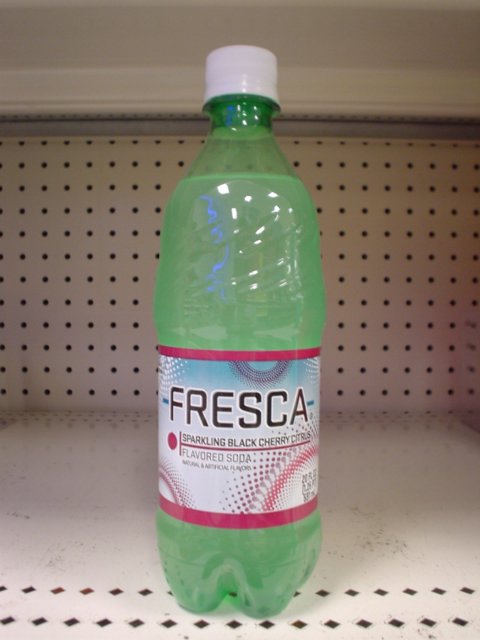
Fresca arrived with sleek energy and a clean, modern pitch. In the late 1960s, low-calorie beverages started to represent control, discipline, and contemporary taste, and Fresca fit that shift with striking branding. The can looked fresh, precise, and unmistakably designed for a changing grocery mindset.
Flavor reactions stayed split. Some people enjoyed the crisp citrus edge, while others found it thinner than full-sugar options. That divide captures the decade’s broader experiment: packaging and aspiration moved quickly, while taste expectations changed slowly. The look felt immediate, but the palate needed time.