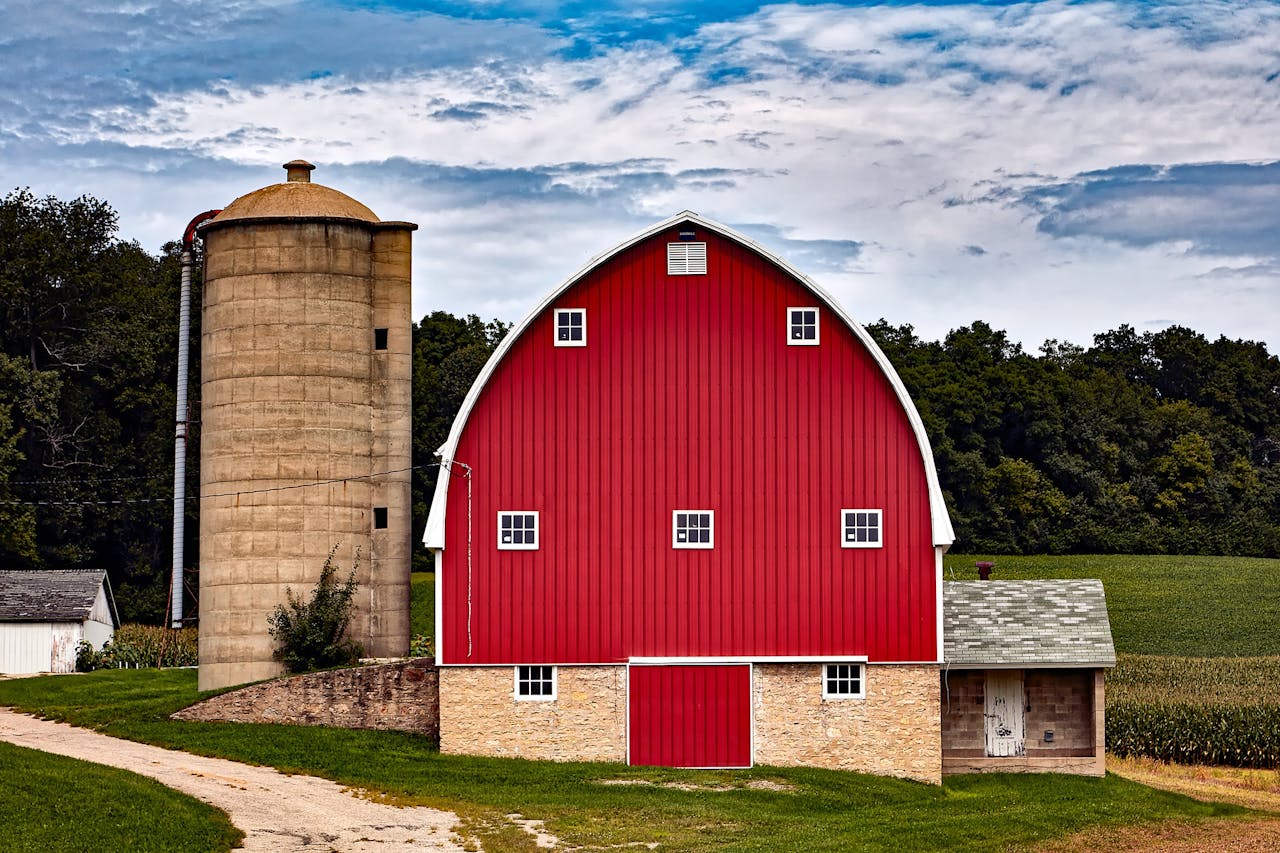
Long before phones mapped every exit, the American road ran on rumor, hand-painted hints, and promises nailed to fence posts. In the mid-1930s, See Rock City started showing up on barns along major routes, pointing travelers toward Rock City Gardens on Lookout Mountain near Chattanooga. Owner Garnet Carter hired sign painter Clark Byers, and the design spread for decades. Four words, thick white letters, and a black field stayed readable at speed and hard to forget. Each new barn worked like a checkpoint, turning miles into a game and curiosity into a plan. Families measured distance by the next painted roof, not the next town. What looked like local paint became one of America’s earliest roadside branding networks.
A Four-Word Hook Built for Speed
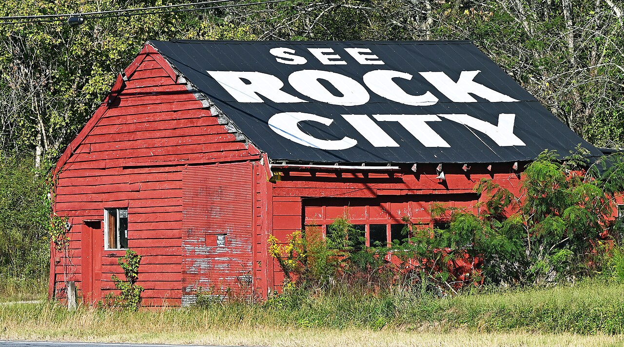
See Rock City was built for the windshield moment: four short words, thick white letters, and a black field that cut through hay, red clay, and bright noon glare, still readable at 55 mph. On two-lane roads where dust, bugs, and speed blurred smaller notices, the phrase landed in a single glance, then resurfaced at the next ridge, timed perfectly for the brief calm after a curve. Because the same message kept returning every few miles, drivers started trusting it as informal wayfinding, kids began spotting it like a game, and family schedules bent around the promised stop, somewhere ahead on purpose, not a random pull-off at all.
Barns Became the Billboard Network
Instead of buying city walls, the campaign claimed the countryside, choosing barns that faced traffic, sat near gentle bends, and stayed in view long enough for a driver to read twice. Each roofline became a landmark, and the message travelled as a chain from farm to crossroads to state line, following the new rhythm of paved roads, Sunday drives, and vacation caravans that packed sandwiches in wax paper. With enough barns in sequence, the signs formed a low-cost broadcast system that never needed electricity, only fresh paint, and it proved that attention could be purchased one mile at a time without looking like an ad buy. Either.
A Great Depression Deal With Farmers
The pitch to barn owners was practical: a free paint job for a tired building, plus passes to Rock City and small promotional items, in exchange for a wall or roof that faced the road. During the Great Depression, that trade meant upkeep without cash, and it made the message look like neighborly maintenance rather than rented media, especially when rain had already washed older paint into gray streaks. Byers handled ladders, tin, and long drives between counties, and while some owners chose a modest $3 instead of the giveaways, the bargain still produced an ad that felt rooted in local need, not corporate reach. In plain sight too.
Consistency Created Trust

Consistency did the heavy lifting, and each sign stayed recognizable even when painted by hand on whatever boards or tin the barn offered. No matter the county line or season, the message kept the same white-on-black treatment, with blocky letters spaced for distance, staying legible through rain haze, summer glare, and the visual noise of gas pumps, fruit stands, and hand-lettered motel boards. That repeatable look trained drivers to recognize the mark before they even finished reading, and familiarity turned into trust, the way a dependable road sign appears again right after doubt creeps in, on cue, without asking for attention.
Every Surface Was Custom, Not Copy-Pasted
Barns came in every size and shape, so the layout had to flex without losing instant recognition. A wide roof could stretch into a longer promise about seeing seven states, while a narrow wall might carry only the core name, stacked and centered to match the boards and stay readable from the far lane. That adaptability kept the brand intact without looking factory-made, and the small quirks of spacing, weathered knots, and brush edges gave each sign the feel of local handwriting, which made the campaign look human even as it scaled across states, an early kind of responsive design for the highway, for real people in real cars, too.
A Legend Was Baked Into the Promise
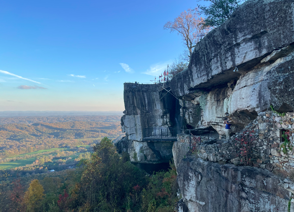
Rock City sold more than a stop; it sold a story that could be repeated at dinner without having to explain much. After the gardens opened in 1932 on Lookout Mountain near Chattanooga, the barn signs leaned on the line See 7 States from Rock City, turning a view into a challenge that sounded measurable, brag-worthy, and official. In an era when families weighed every mile, every gallon, and every restless child in the back seat, that promise made the detour feel earned, not just a break, and each painted reminder built momentum until the overlook, the photos, the postcards, and souvenirs for cousins became the point of the day.
They Turned the Drive Into a Game
Once the words appeared, the road gained a pattern, and boredom had something to argue with. Travelers scanned treelines and pasture gaps for the next black rectangle, called it out over engine noise, and made up rules on the fly: first to spot it wins, five in a row means the stop is guaranteed, missing one means it is time for snacks. By turning a long drive into a series of quick recognitions, the barns created tiny bursts of attention that kept the car awake, and the destination started to feel less like an attraction and more like the punchline everyone was driving toward, mile after mile, without anyone saying it out loud.
The Brand Lived in Everyday Geography
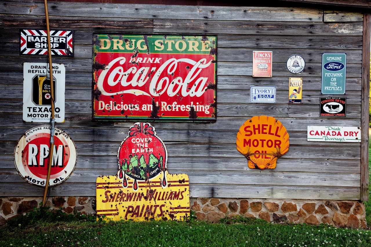
Because the ads lived on working barns, they blended into everyday geography instead of shouting over it. The slogan shared space with silo shadows, drying tobacco, feed-store turnoffs, and mailboxes, borrowing the credibility of place and the quiet suggestion that someone nearby had decided this stop was worth mentioning. After years of repetition, a single painted roof could function like a landmark the way a water tower does, turning up in casual directions and family stories, and showing how a brand can embed itself by behaving like part of the landscape, not an interruption, especially where the highway doubled as Main Street.
Weathering Turned Ads Into Americana
Decades later, fading paint and patched tin only deepened the charm, making the signs feel like artifacts from the open-road era rather than active salesmanship. At its peak, about 900 barns across 19 states carried some version of the message, yet time, development, and collapsing roofs have thinned that map, turning each surviving sign into something closer to public memory than advertising. That scarcity has sparked documentation projects and repainting efforts, and the result is strange and beautiful: a marketing line that now behaves like Americana, still snapping attention back to the horizon at highway speed all over again.