Some cars turn heads because they are fast or famous. Others turn heads because they look like spaceships, snails, or tiny living rooms on wheels. Strange styling is rarely random, it usually solves a real problem like squeezing more people inside, cutting drag, or keeping costs low. This list sticks to real vehicles that were produced or publicly sold. You will see how designers bent shapes to match goals, and why those choices still make people stare today.
If you are car curious, weird design is a great teacher. A single front door can make city parking easier. Flat stainless panels can limit curves, so designers commit to triangles. Tall glass can improve visibility, even if it makes a car look like a fishbowl. As you read, pay attention to the purpose behind the look. The goal explains the weird.
What makes a car look strange
We picked cars that defied the mainstream of their era, not internet renderings or one-off art cars. “Strange” means proportions, panels, or layouts that break the usual rules. Each pick earned a spot because its look came directly from a real purpose.
Stout Scarab (1930s, U.S.)
The Scarab is often called a minivan idea before minivans existed. Smooth, aircraft-style bodywork, lounge seating, and a central table made it look like a rolling studio apartment. According to the Detroit Historical Society, only a handful were built as prototypes, yet the layout previewed family haulers decades early.
Its shape followed function. The Scarab put people first, then wrapped the cabin in a sleek shell to reduce drag. It set the tone for later vans that favored space, comfort, and easy movement inside the cabin.
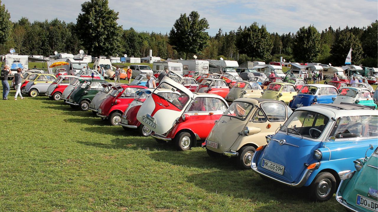
BMW Isetta (1955–1962, Germany)
The Isetta put a door on the front. You stepped in like entering a tiny living room, which made parallel parking simple on tight streets. According to BMW’s own history page, BMW licensed the idea and refined it for postwar Europe’s needs.
The look is odd because the design goal was a tiny footprint, easy entry, and low cost. Bubble windows and a domed body reduced complexity. It was weird, but it worked for crowded cities.
Peel P50 (1962–1965, Isle of Man)
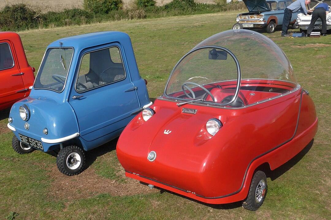
The P50 is the smallest production car most people will ever see. It has one seat, three wheels, and a body shorter than some skateboards. The look came from a single mission: to make city parking and maneuvering almost effortless.
You can think of the P50 as extreme micro-mobility before that term was popular. It was practical at ultra low speeds and ultra-short distances, which explains the toy-like proportions.
Amphicar 770 (1961–1968, Germany)
A car that swims has to look different. High sides, sealed doors, and propellers made the Amphicar resemble a bathtub with fins. Lane Motor Museum documents the twin props, about 7 mph water speed, and a Triumph engine that worked on land and water.
The funny shape is pure function. You need buoyancy, shallow drafts, and splash resistance. The design delivered those traits, even if it looked odd next to normal sedans.
Reliant Robin (1973–2002, U.K.)
Three wheels, fiberglass body, unforgettable stance. The single front wheel defined the Robin’s cartoon profile and kept the vehicle cheaper and lighter under specific U.K. rules. The result was a car that looked unbalanced but offered budget mobility.
Its shape signals tradeoffs. Simplicity, low weight, and tax advantages mattered more than classic proportions. That is why it remains a pop-culture icon and a genuine piece of everyday transportation history.
AMC Pacer (1975–1980, U.S.)
The Pacer looked like a rolling terrarium. It was unusually wide for its length, with huge windows that wrapped the cabin. Hagerty’s profile notes how those proportions chased space and visibility far beyond typical 1970s compacts.
The weirdness served a goal. Big glass helps you see, and width helps you sit comfortably. The tradeoff was a shape that stood out in every parking lot, even decades later.
Nissan S-Cargo (1989, Japan)
Imagine a delivery van styled like a snail. The S-Cargo’s smooth sides worked as rolling billboards, and the name itself plays on “escargot.” Designers embraced cute curves because the van doubled as advertisement and city tool.
It looks like a mascot on wheels, which was the point. Friendly shapes invite attention, and that attention helps small businesses. Function and branding drove the silhouette.
Isuzu VehiCROSS (1997–2001, Japan/U.S.)
Short body, tight overhangs, and thick black cladding made the VehiCROSS look like a trail shoe. The cladding protected panels off-road, the height helped approach angles, and the narrow windows sold attitude without sacrificing structure.
Underneath the drama, Isuzu used proven parts. The look was aggressive because the aim was durability and youth appeal. The design kept that promise, which is why the VehiCROSS still reads as tough today.
Fiat Multipla (1998–2010, Italy)
Two rows of three seats made the Multipla look like a friendly frog. The wide cabin, split-level headlights, and tall glass delivered space and sightlines in a short body. Stellantis Heritage highlights the Multipla’s functional design choices and why they mattered for families.
The result is weird, yet clever. Six people fit comfortably, with easy entry and good visibility. The exterior shows the interior plan pushed outward, which is why it still looks unusual.
Pontiac Aztek (2001–2005, U.S.)
Angular lines, split grilles, and mixed surfacing made the Aztek famous for controversy. Car and Driver’s deep dive explains how the sharp concept lost coherence on the way to production, while keeping the face that defined its reputation.
The Aztek tried to be a lifestyle Swiss army knife. Camping features, cargo ideas, and a bold stance lived inside a shape that challenged taste. It taught the industry how quickly ambition can clash with reality.
Nissan Cube (U.S. 2009–2014; Japan 1998–2019)
The Cube looks boxy on purpose. An asymmetrical wraparound rear window improves diagonal visibility, and the tall roof creates a lounge-like interior. Even the ceiling pattern, shaped like water ripples, supports a calm vibe.
You get city-friendly packaging and great sightlines, traded for sleek lines. The Cube’s honest box form puts people first, which is why it remains a cult favorite.
Citroën Ami (2020–present, Europe)
Legally a city quadricycle in parts of Europe, the Ami uses mirrored doors and shared front and rear panels to cut costs. Those shared parts create its playful cube shape, while the tiny size and speed caps match crowded streets.
It looks like a toy because it is built for short trips and low prices. City rules and budget goals drove the symmetry, so the style follows the spreadsheets.
Tesla Cybertruck (2023–present, U.S.)
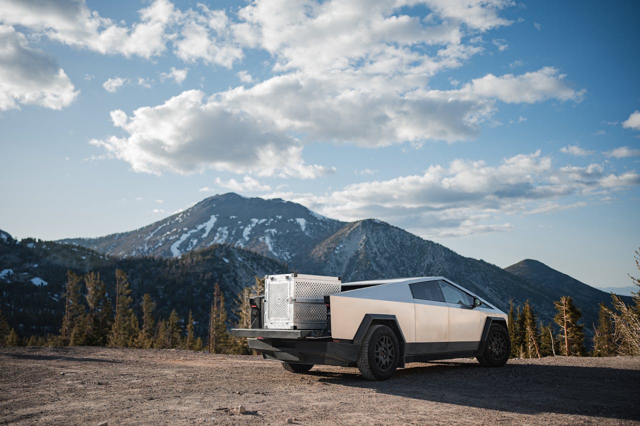
Flat stainless panels are hard to bend, so the truck became a sharp trapezoid. Reuters covered the launch and the stainless “exoskeleton” approach, which pushed the sheet metal to define the silhouette itself.
The look is polarizing, yet logical. Material limits and production goals shaped the triangles. Love it or not, nothing else on the road reads like this at a glance.
How to decode weird design in the wild
Weird is a clue, not a punchline. When a car looks unusual, ask what purpose the shape serves. Is it visibility, cabin space, material limits, or cost control. If you see tall glass, think sightlines. If you see flat planes, think material constraints. If you see an odd door location, think city parking and easy entry.
Pro tip: turn weird into a game on your next drive. Pick a strange car, then list three things the shape probably improves. Parking, payload, or price are common answers. You will start to see the design logic everywhere, which makes car spotting way more fun.